


ZT Hakimi
- Styles - 22 (11 Weights + 11 Italics)
- Variables - 2 (Roman + Italic)
- Version - 1.000
- Glyphs - 600
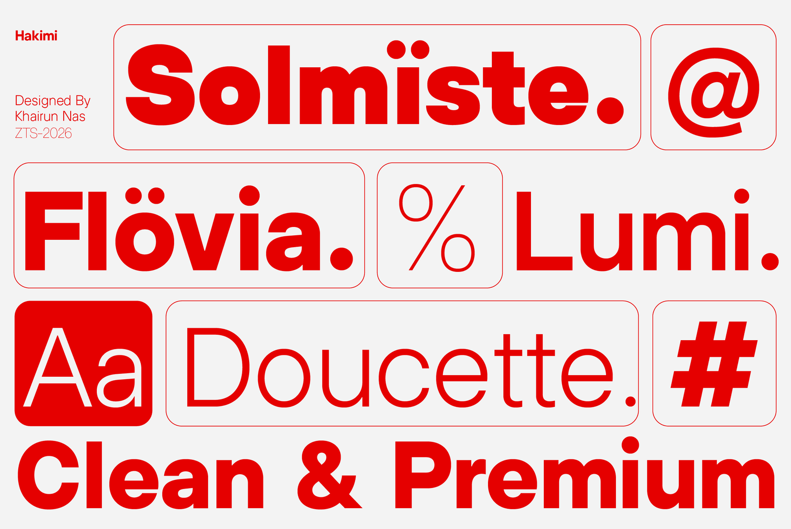
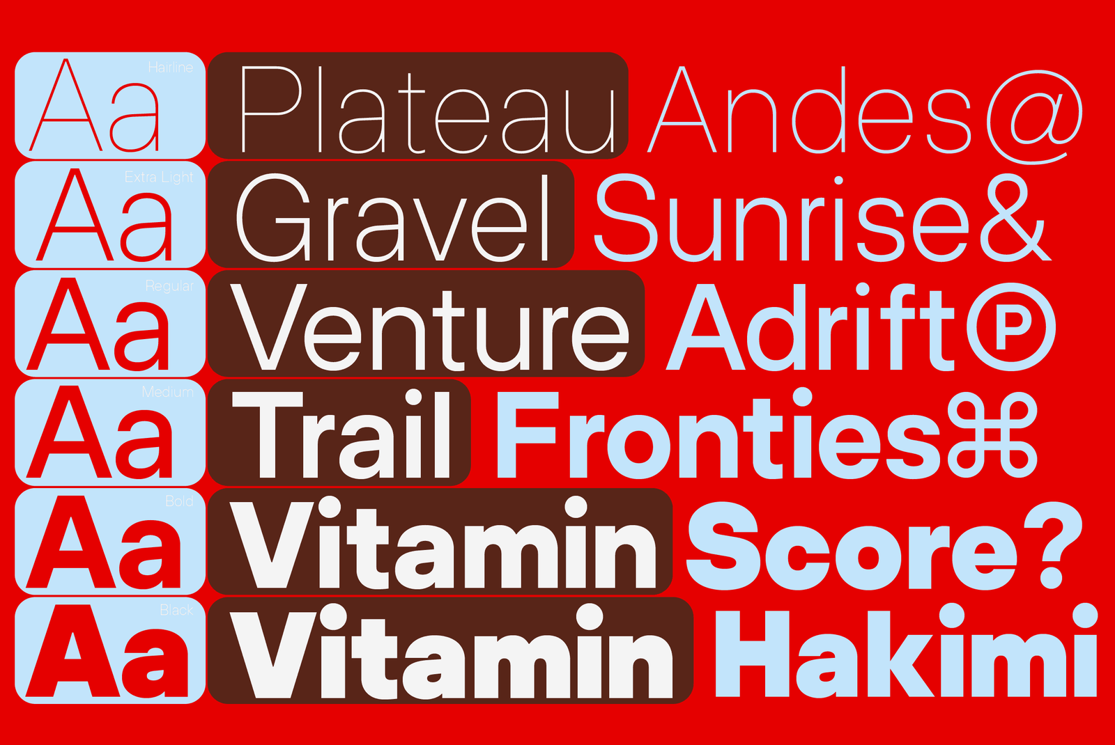
- OSF, TF, and TOSF Figures
- Case-Sensitive Forms, Ordinals, Slashed Zero, Fractions
- Subscript & Superscript
- Extended Currency Set
- Specimens
- About
Aa
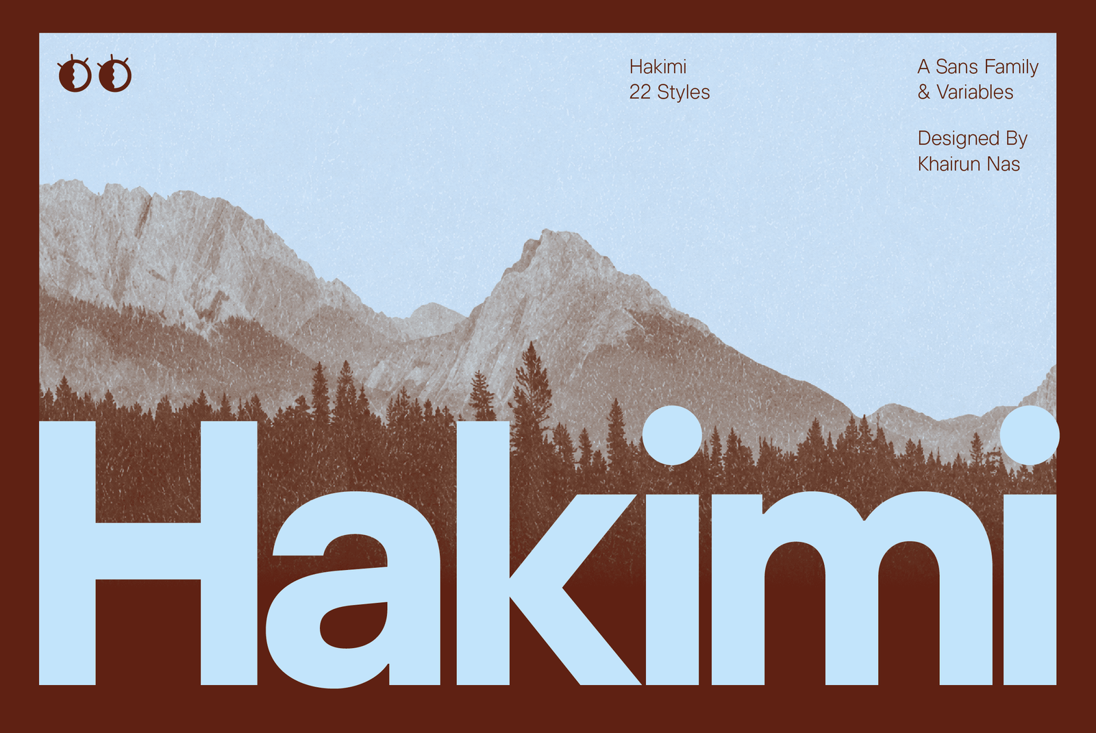
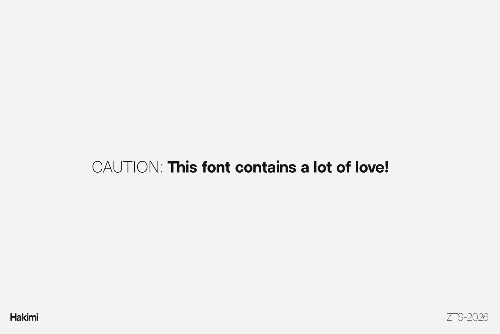
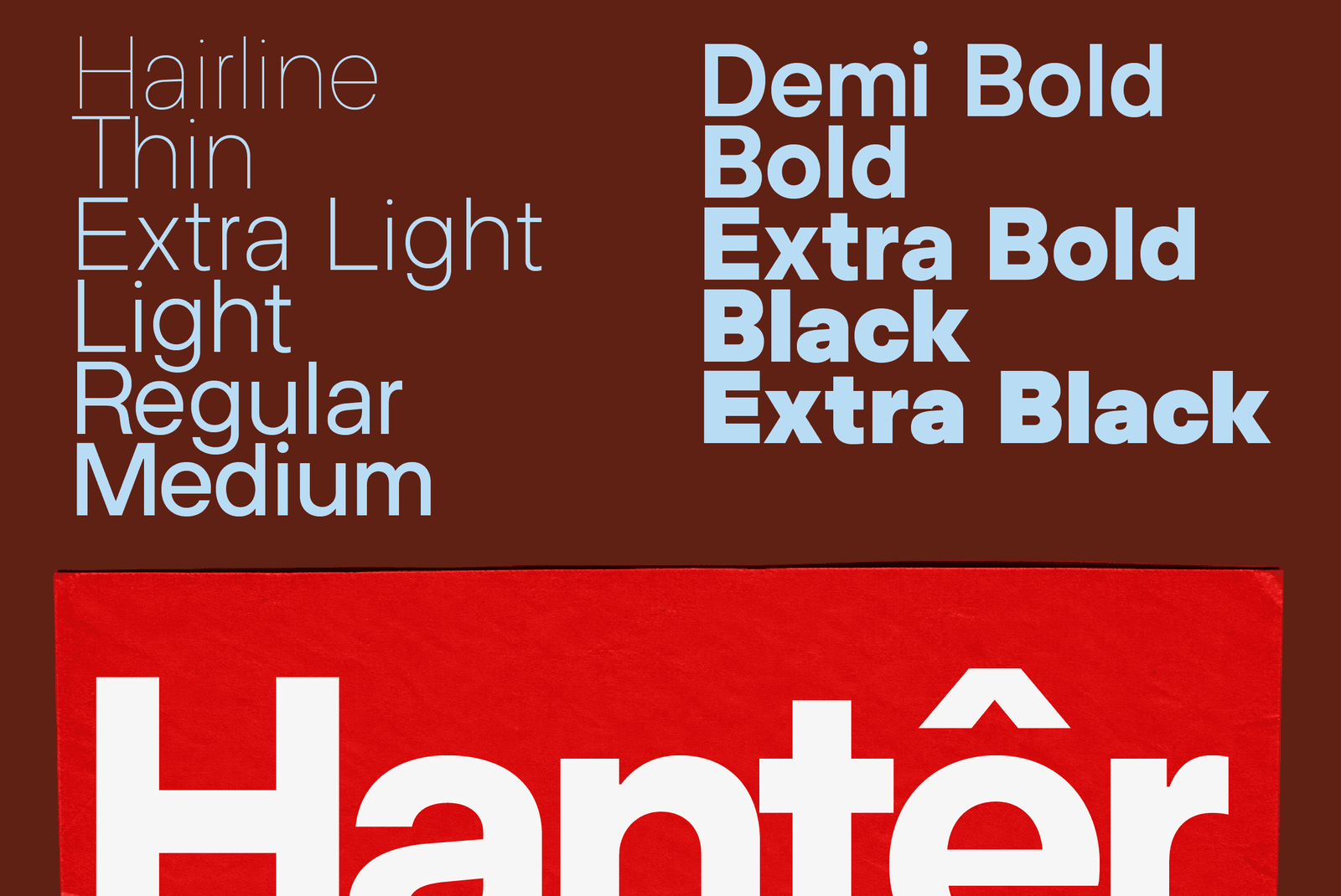
ZT Hakimi is a clean, balanced sans-serif built for straightforward, versatile communication. The family holds a neutral, well-proportioned structure from Hairline to ExtraBlack, keeping letterforms consistent and readable across the full weight range rather than shifting character as it gets heavier or lighter.
Its discipline draws from two different worlds of typography. The clarity and restraint come from the same principles that guide modern interface typography — the kind of quiet, legible system type designed to disappear into a screen rather than compete with it. Its width and weight character take cues from a different tradition: the confident, expressive proportions of contemporary display grotesques, built to hold presence at large sizes without losing composure. ZT Hakimi sits between those two instincts — precise enough for interfaces, expressive enough for headlines.
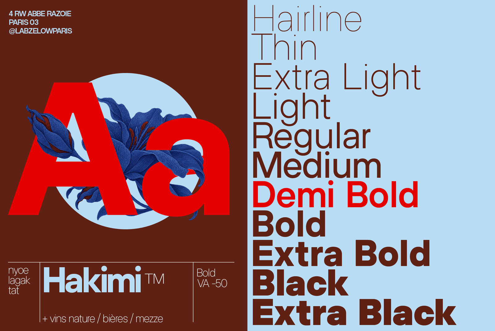
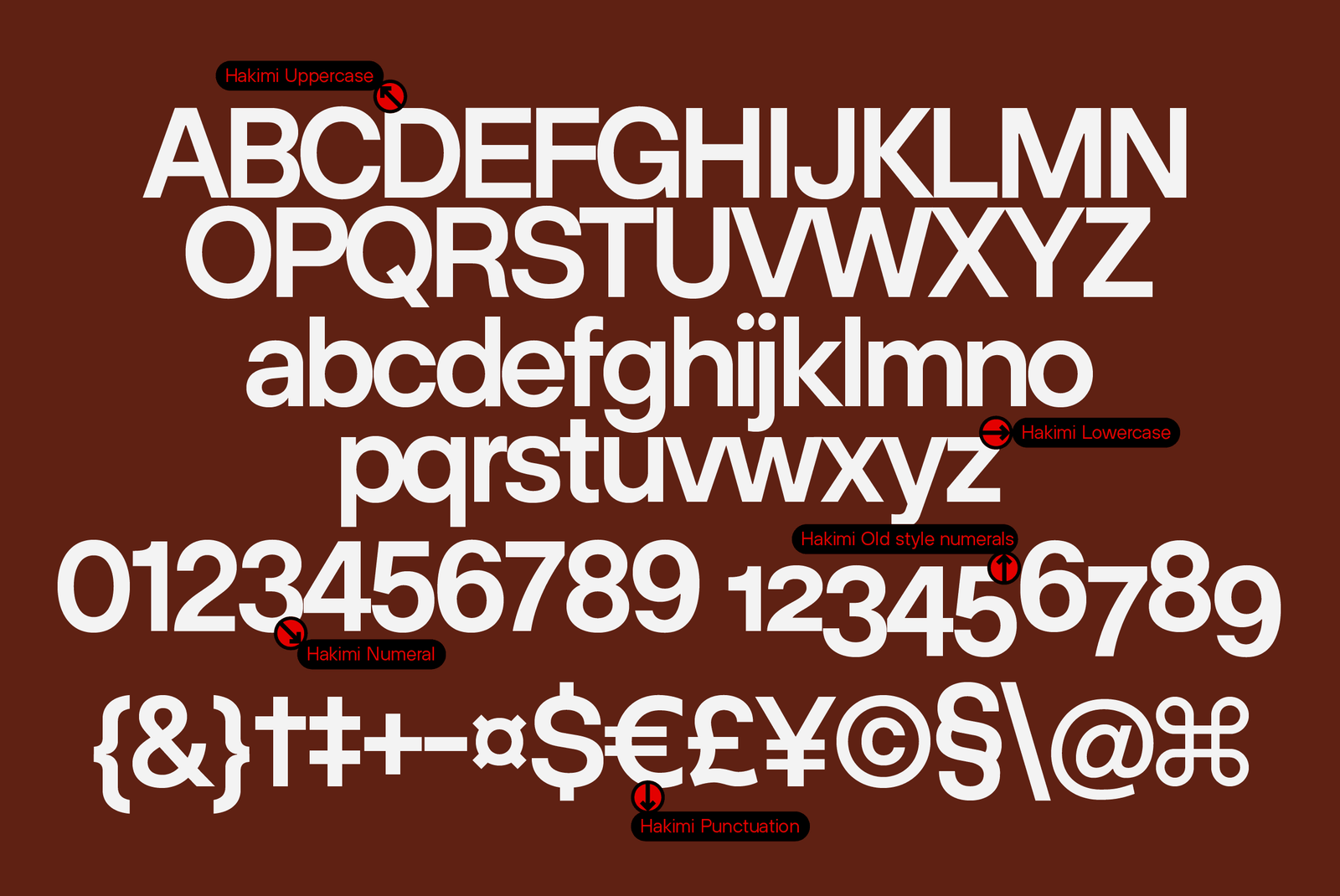
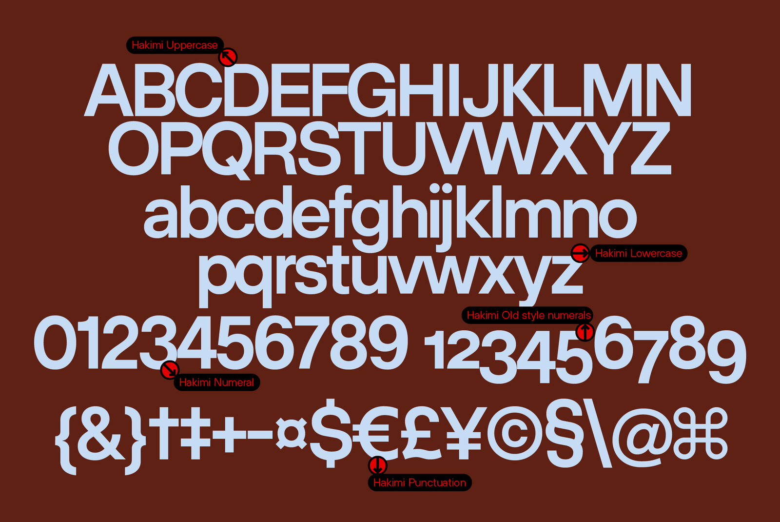
The family spans eleven weights in both upright and italic, for 22 styles total, alongside two variable font files covering the full weight range. Glyph coverage totals 600 characters across the Latin set, with support for old-style, tabular, and tabular old-style figures, case-sensitive forms, ordinals, slashed zero, fractions, subscript and superscript, and an extended currency set.
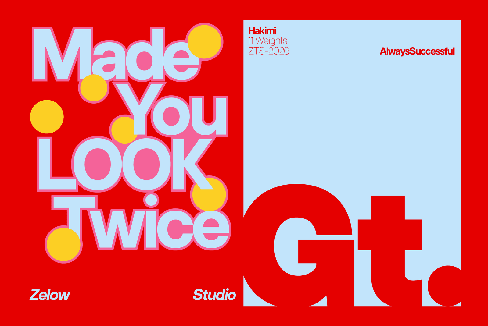
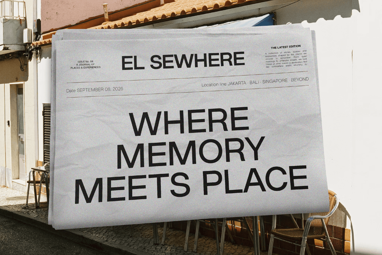
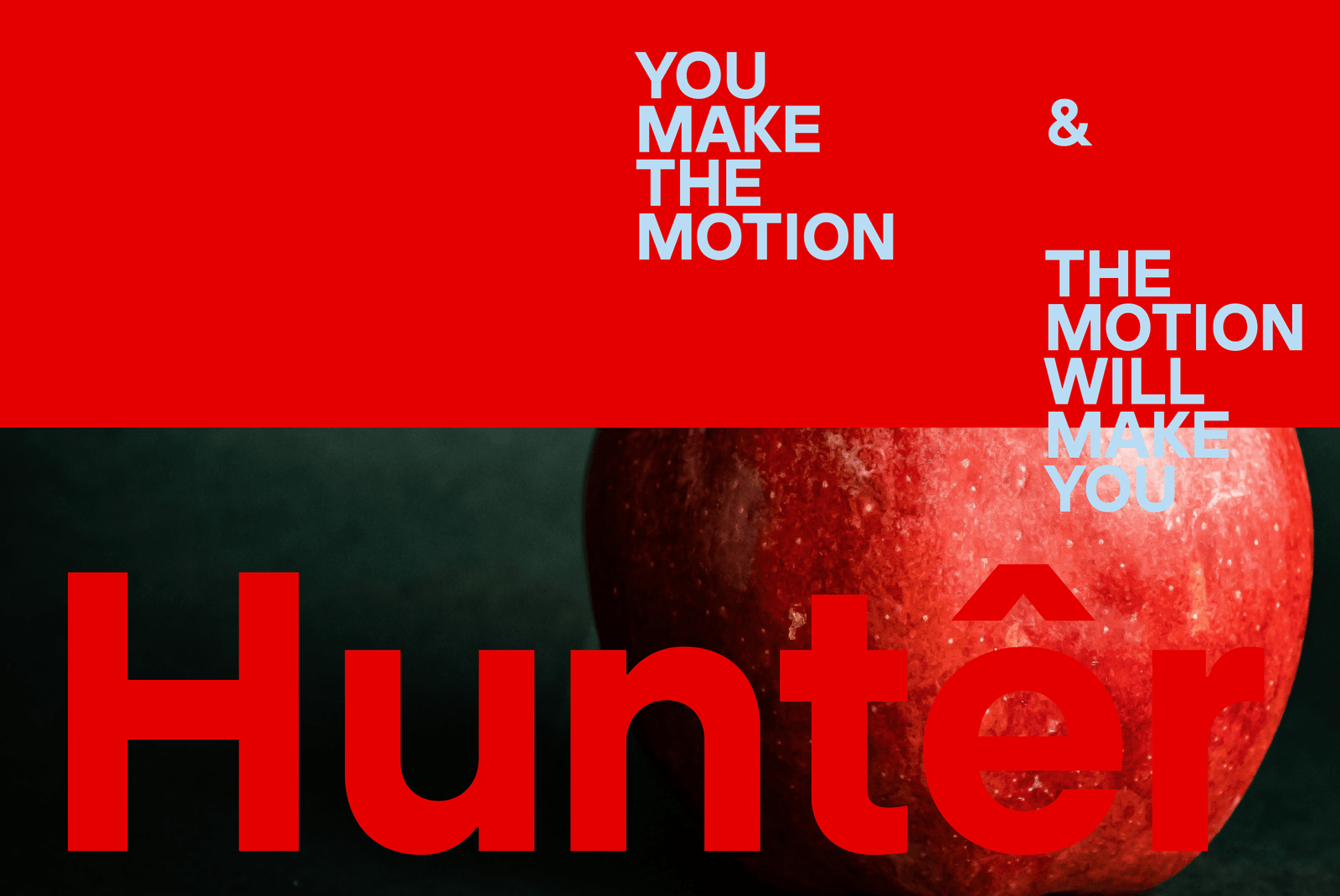
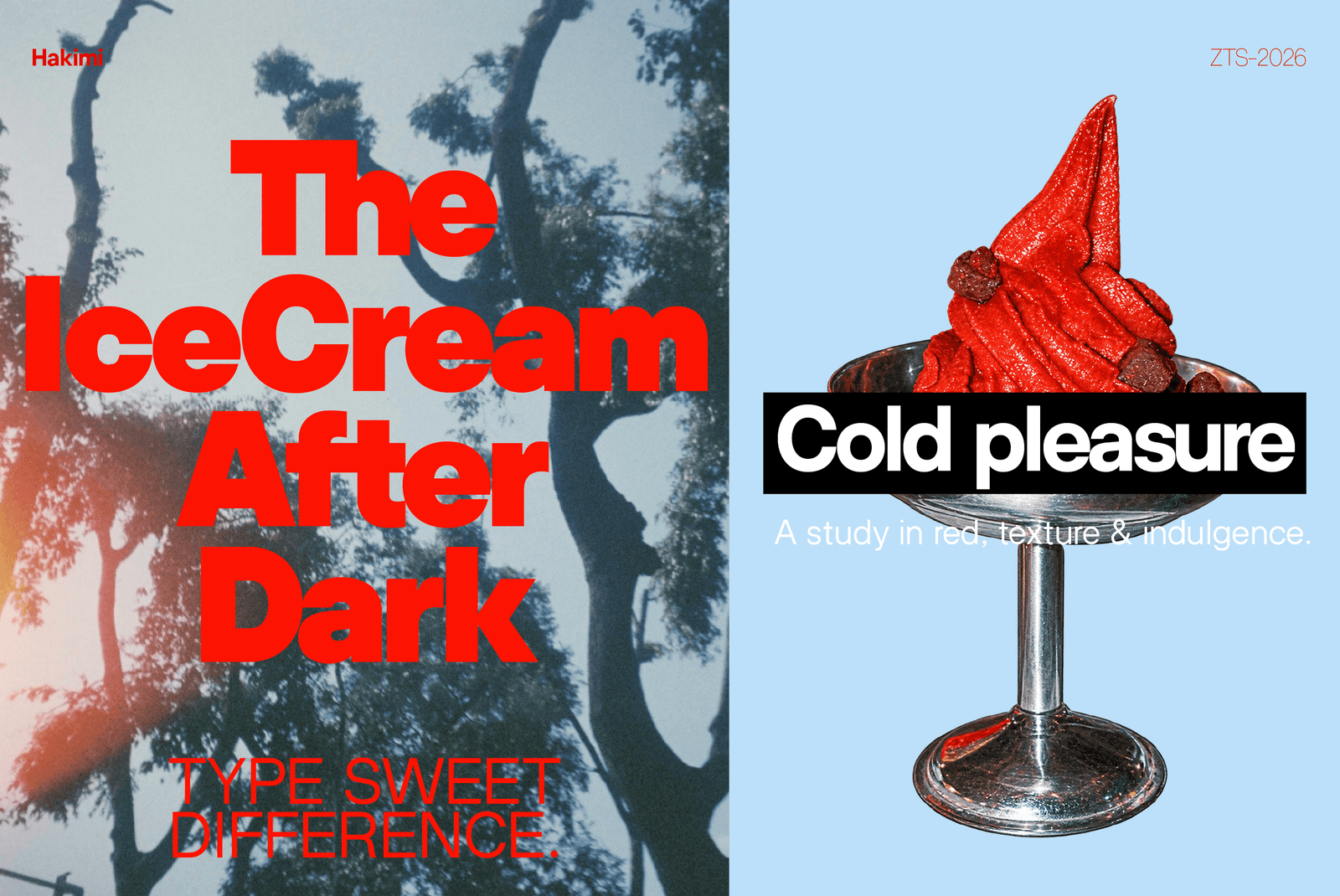
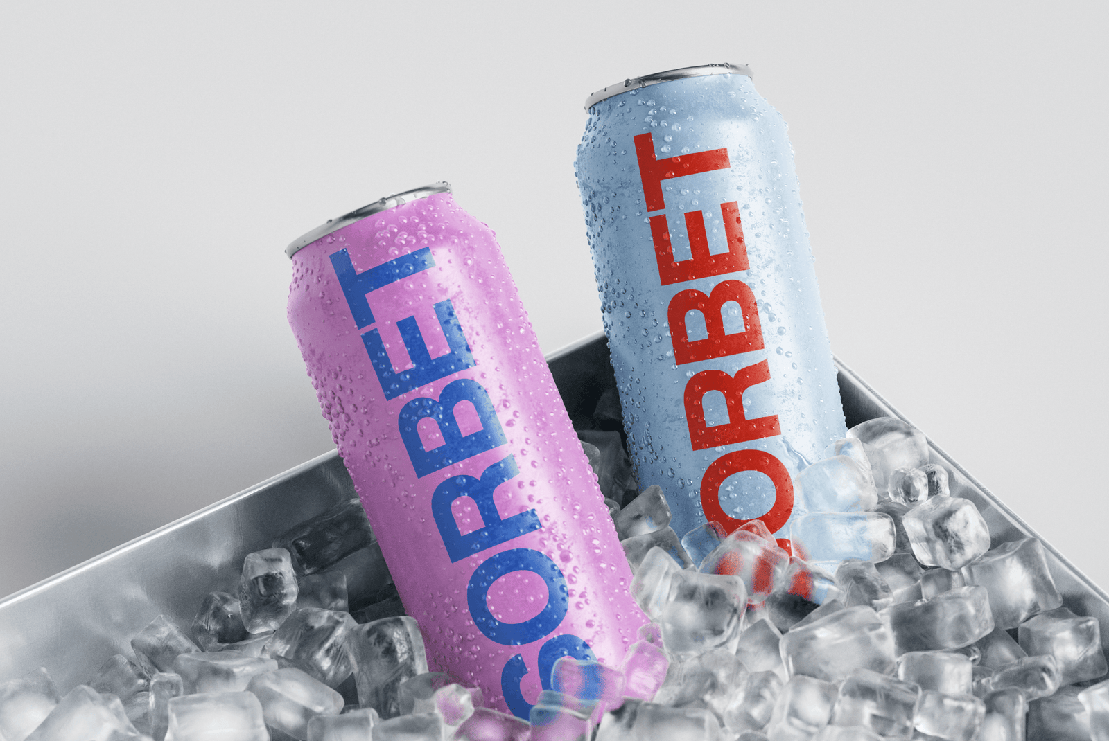
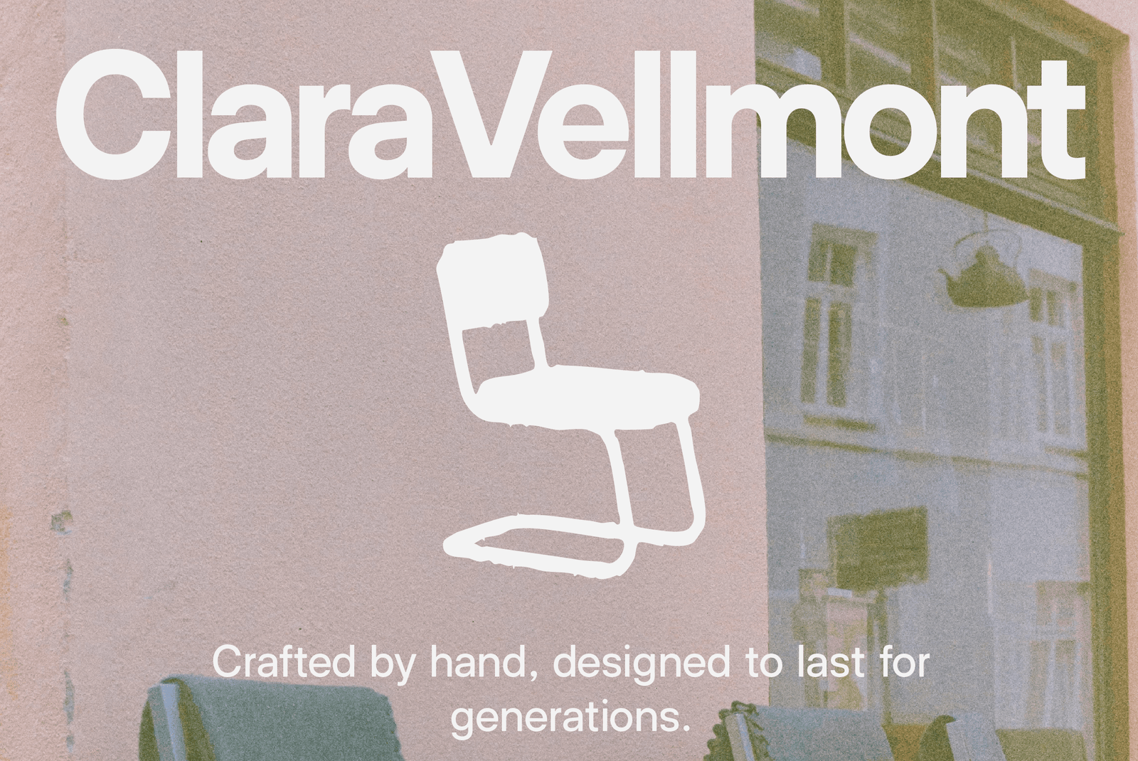
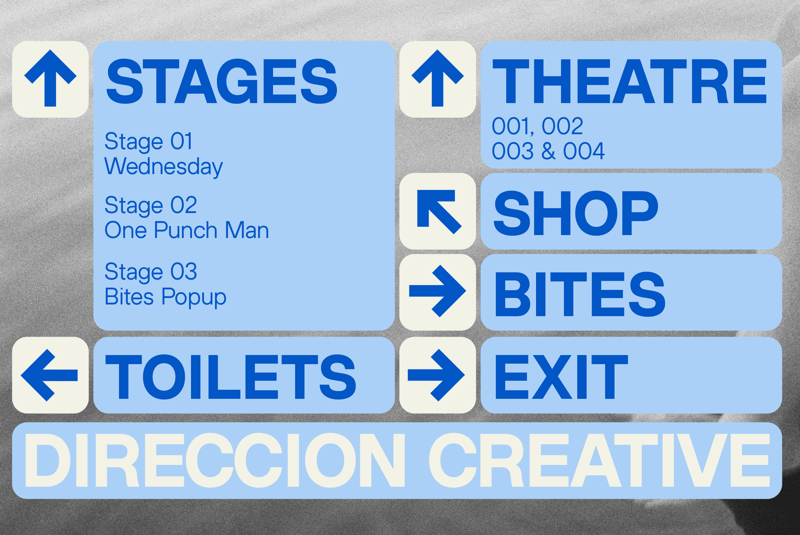
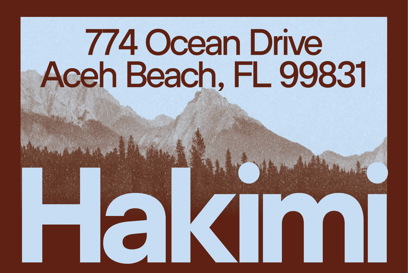
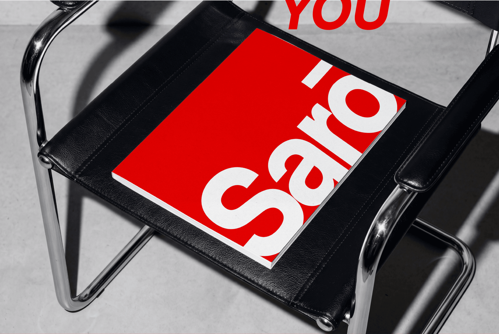
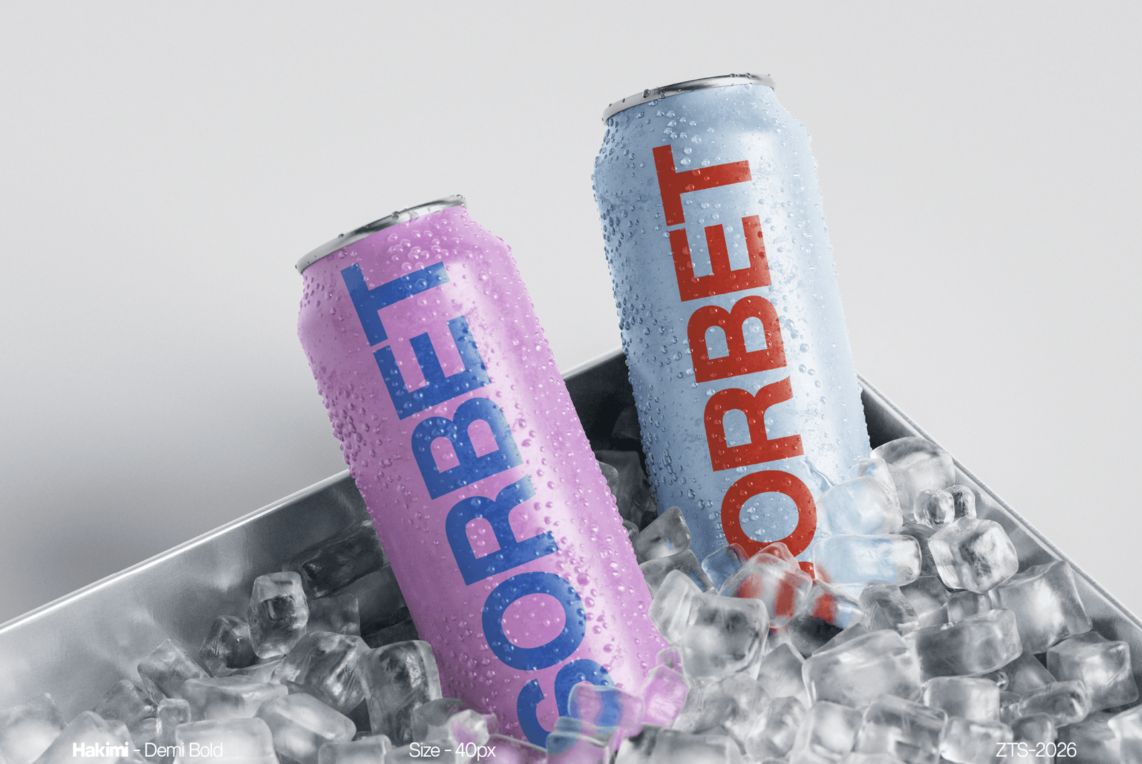
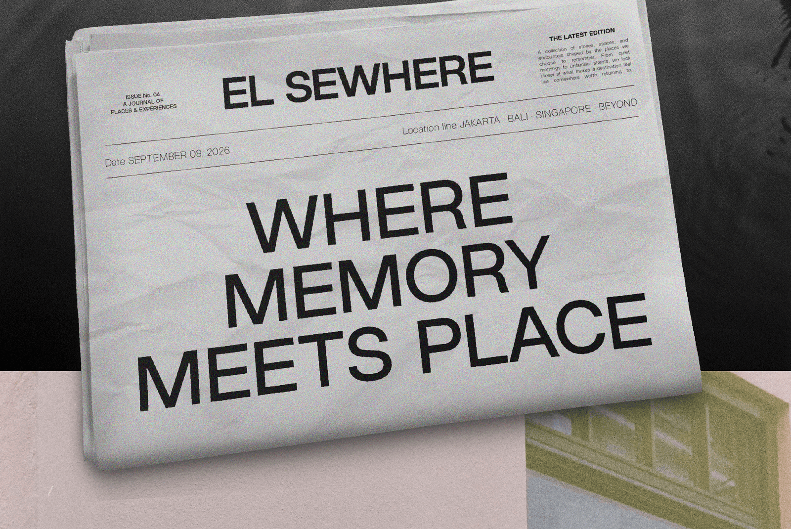
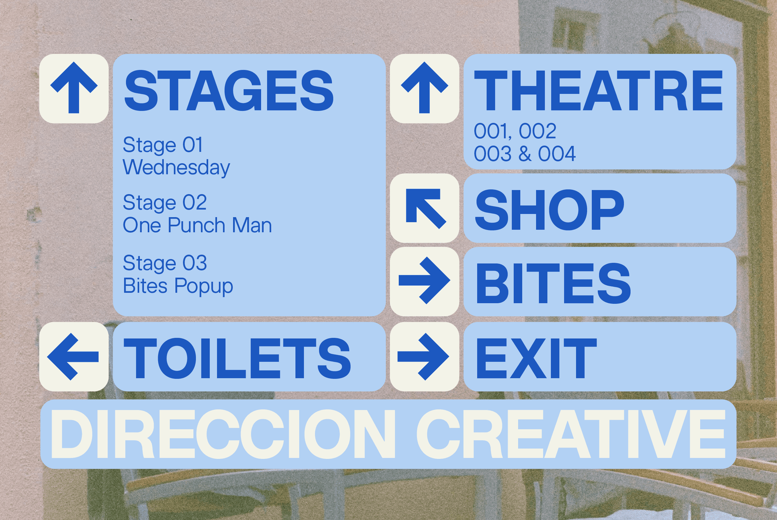
ZT Hakimi works naturally across branding, editorial layouts, packaging, wayfinding, and interface design — built to stay legible and composed at both large and small sizes without drawing attention to itself.
I hope you have fun using ZT Hakimi.
Thanks for using this font ~ Zelowtype
- ZT Hakimi Style List
- 22 Styles
Hairline
Thin
Extra Light
Light
Regular
Medium
Demi Bold
Bold
Extra Bold
Black
Extra Black
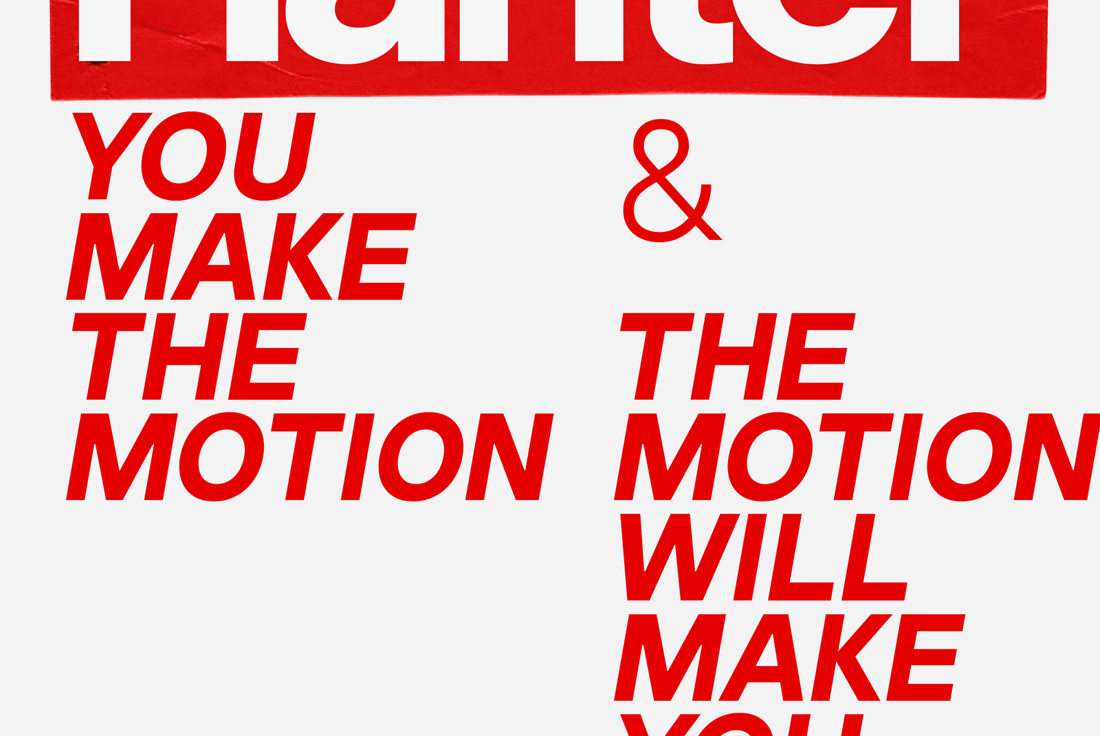
Hairline Italic
Thin Italic
Extra Light Italic
Light Italic
Italic
Medium Italic
Demi Bold Italic
Bold Italic
Extra Bold Italic
Black Italic
Extra Black Italic
Style - ZT Hakimi Black • 900
Size - 225px
Zelowtype ©2026
Clean. Balanced. Timeless.
Style - ZT Hakimi Demi Bold • 600
Size - 225px
Zelowtype ©2026
Precision Meets Presence.
Style - ZT Hakimi Thin • 100
Size - 225px
Zelowtype ©2026
Quiet, Confident Typography.
Style - ZT Hakimi Medium • 500
Size - 28px
Zelowtype ©2026
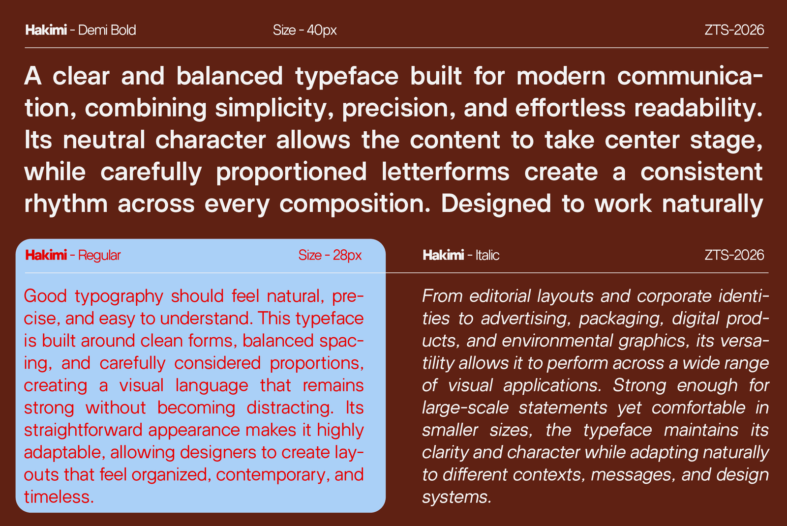
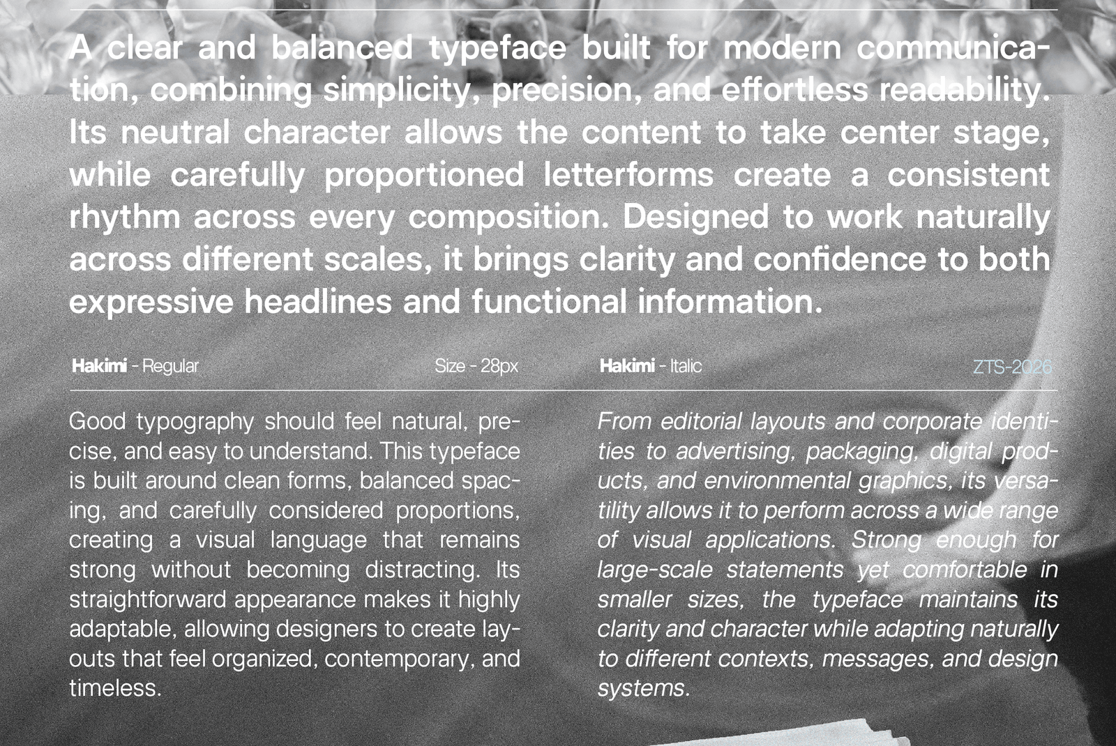
A clear and balanced typeface built for modern communication, combining simplicity, precision, and effortless readability. Its neutral character allows the content to take center stage, while carefully proportioned letterforms create a consistent rhythm across every composition. Designed to work naturally across different scales, it brings clarity and confidence to both expressive headlines and functional information.
Style - ZT Hakimi Regular • 400
Size - 16px
Zelowtype ©2026
Good typography should feel natural, precise, and easy to understand. This typeface is built around clean forms, balanced spacing, and carefully considered proportions, creating a visual language that remains strong without becoming distracting. Its straightforward appearance makes it highly adaptable, allowing designers to create layouts that feel organized, contemporary, and timeless.
From editorial layouts and corporate identities to advertising, packaging, digital products, and environmental graphics, its versatility allows it to perform across a wide range of visual applications. Strong enough for large-scale statements yet comfortable in smaller sizes, the typeface maintains its clarity and character while adapting naturally to different contexts, messages, and design systems.

Commercial Licenses
ZT Hakimi Full Family (22 Styles + Variable)
Print License
E-Pub License
[ZelowStudio]
All Font
Support
- Licences
- Contact
- Terms
- Log In