
ZT Editorial90
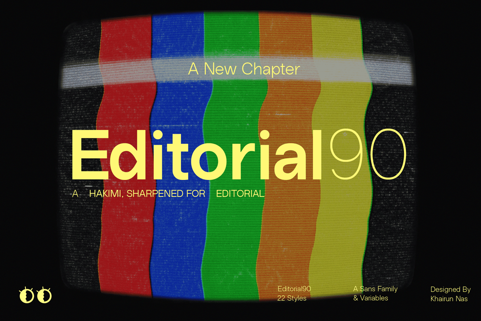
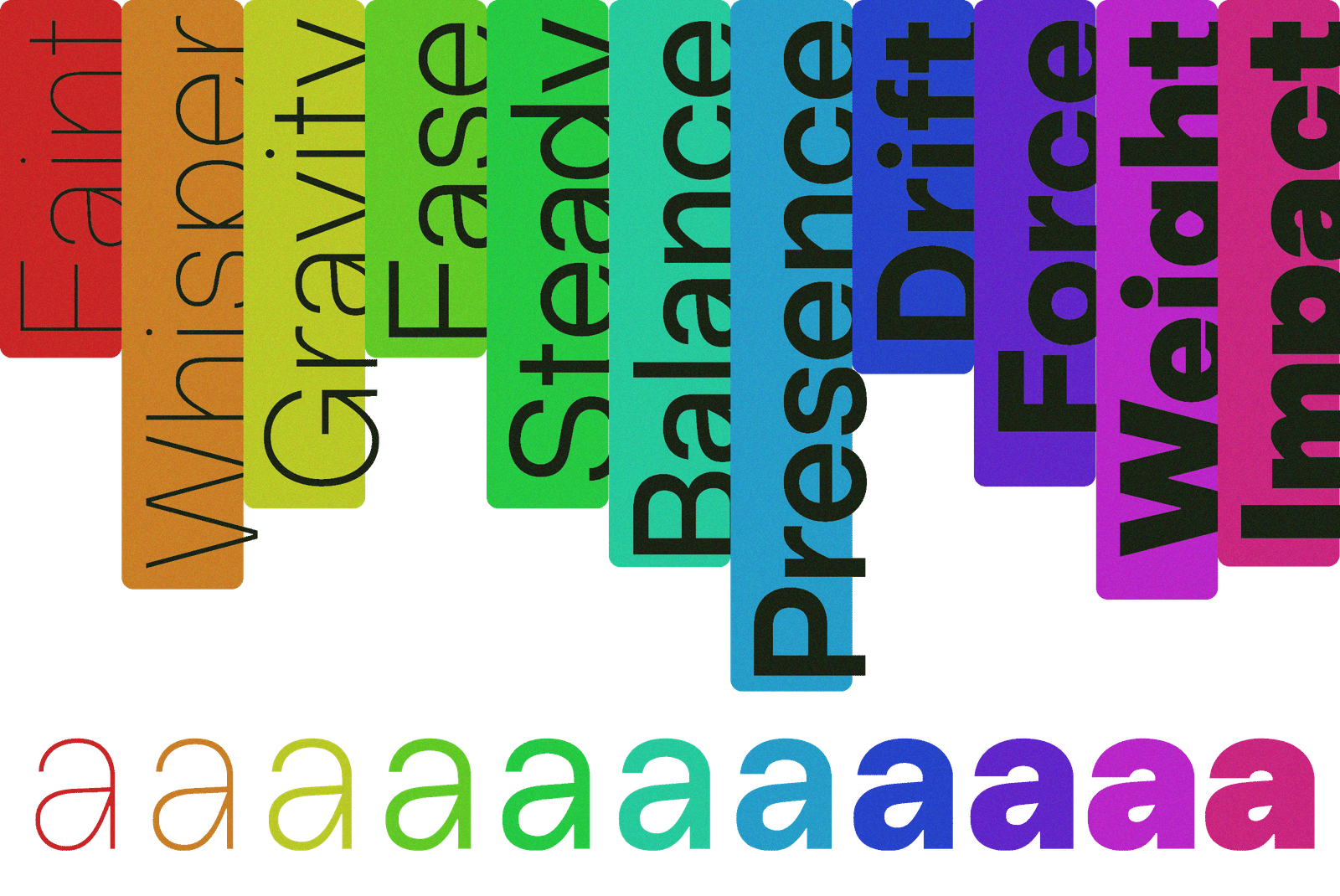
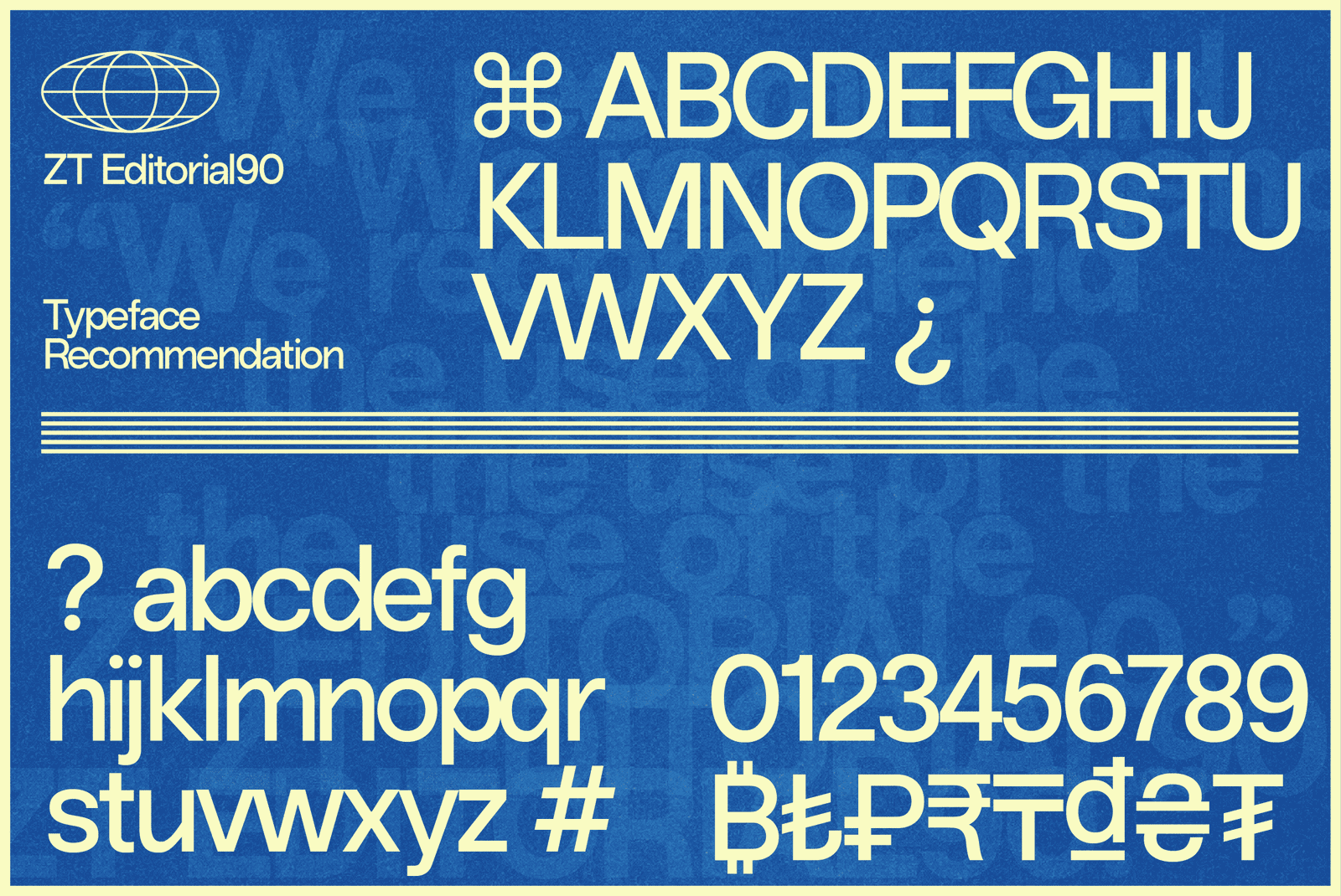
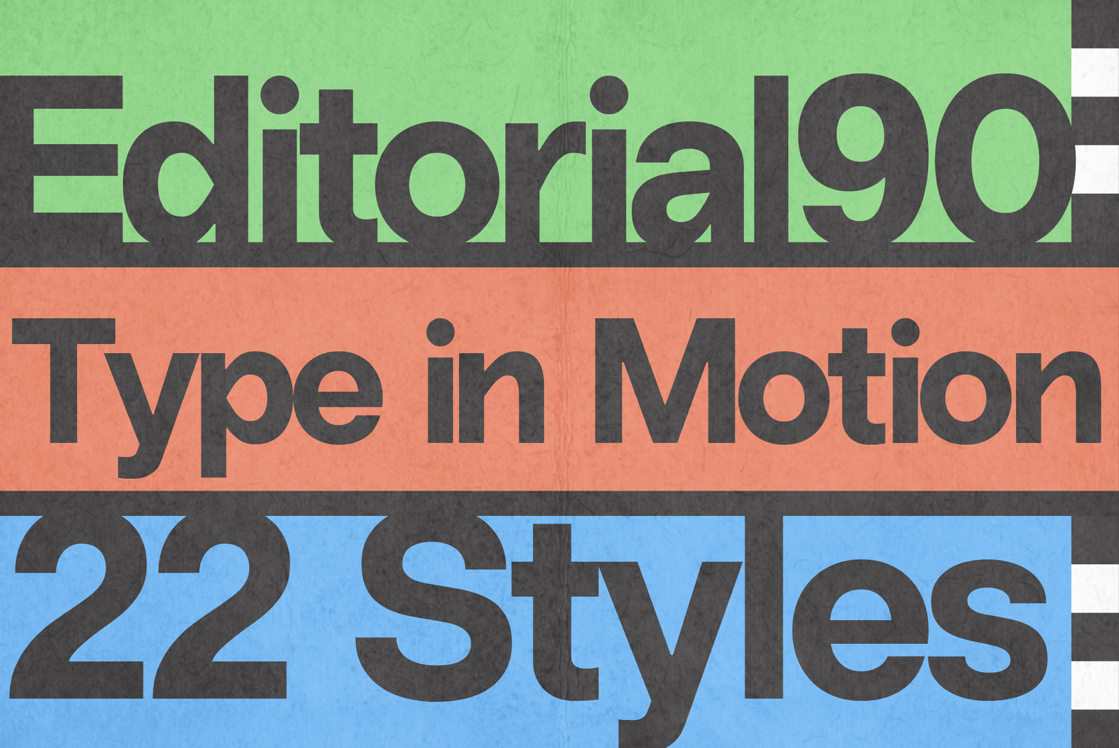
- Styles - 22 (11 Weights + 11 Italics)
- Variables - 2 (Roman + Italic)
- Version - 1.000
- Glyphs - 600
- OSF, TF, and TOSF Figures
- Case-Sensitive Forms, Ordinals, Slashed Zero, Fractions
- Subscript & Superscript
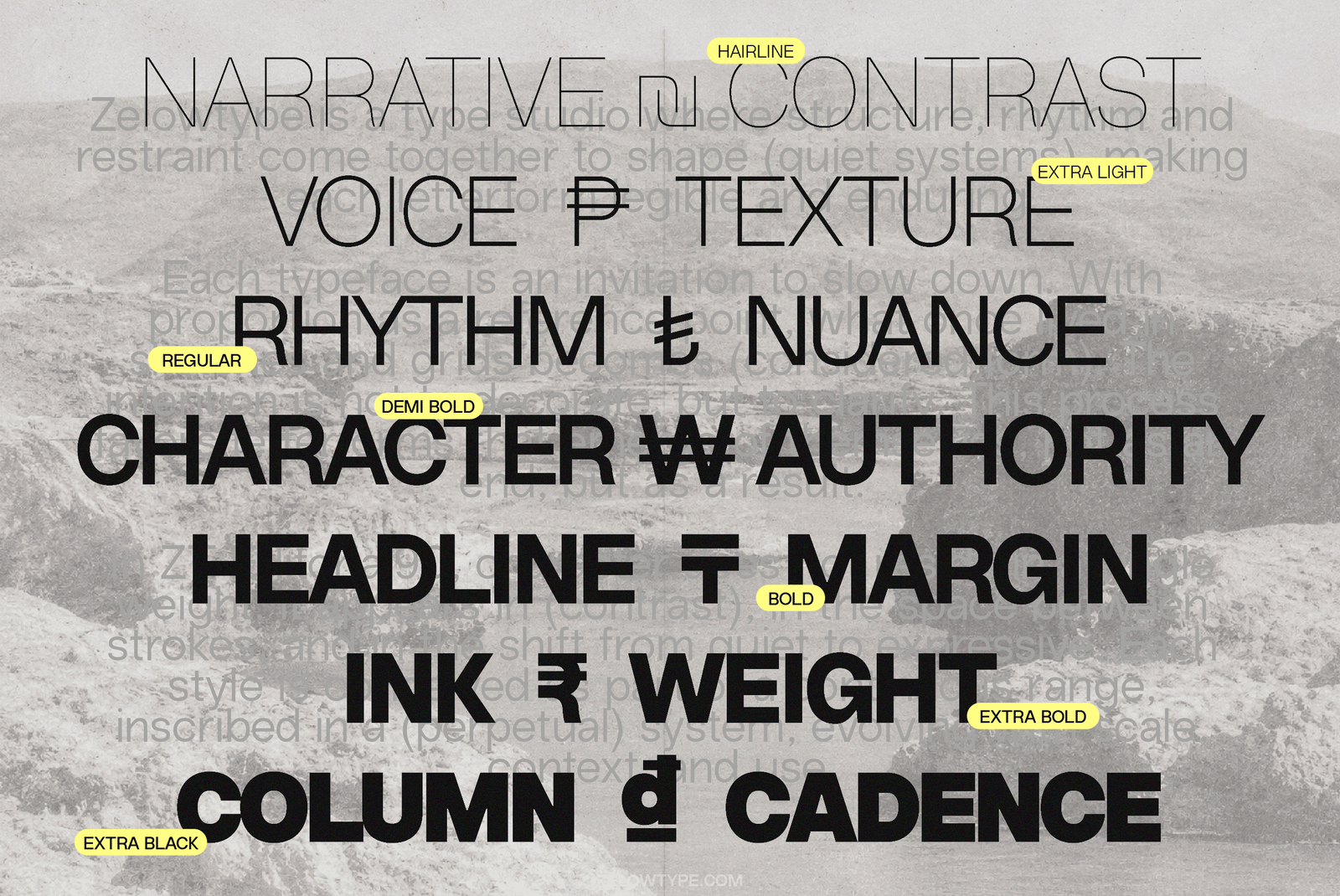
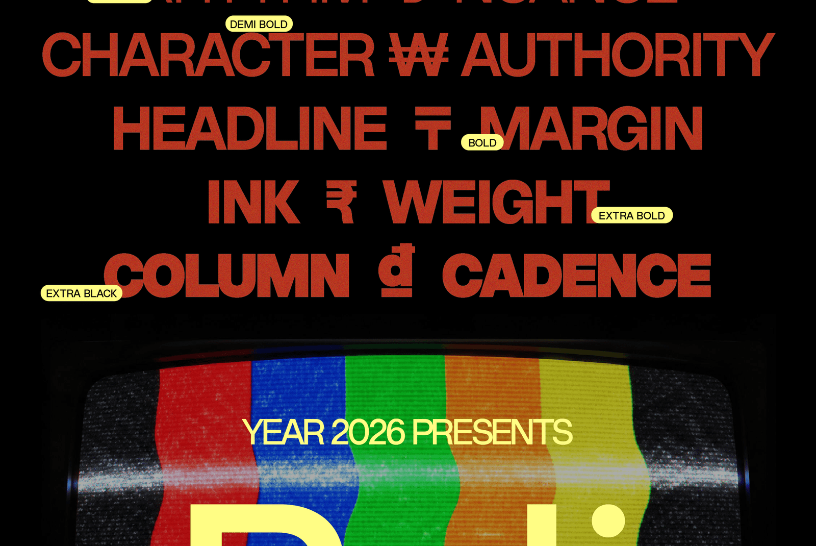
- Extended Currency Set
- Specimens
- About
Aa
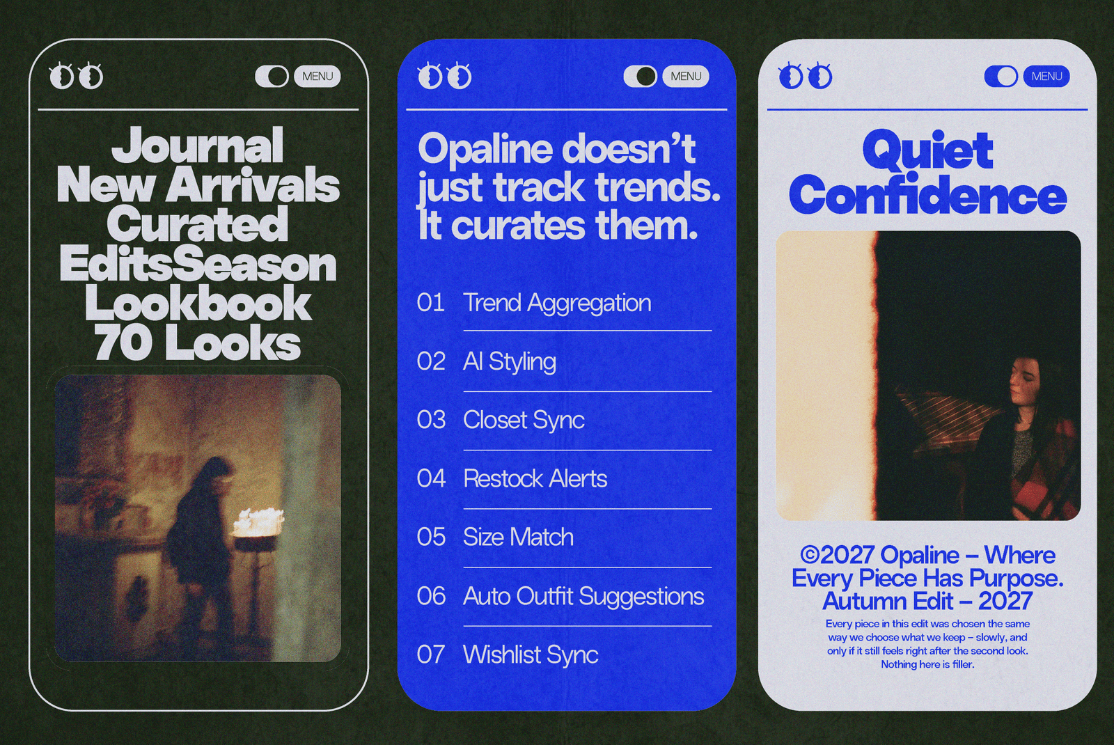
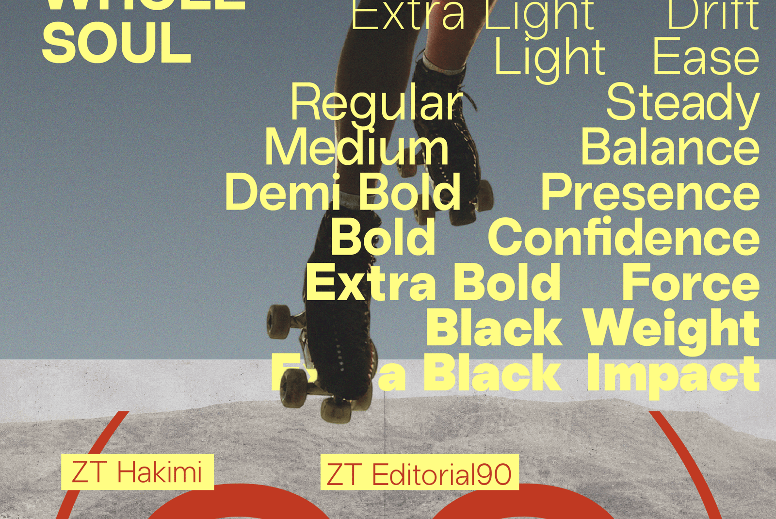
Every typeface starts with a decision about how much it should say. ZT Hakimi chose to say less — clean, balanced, built to carry text without getting in the way. ZT Editorial90 is what happens when that same hand decides to say more, and say it with conviction.
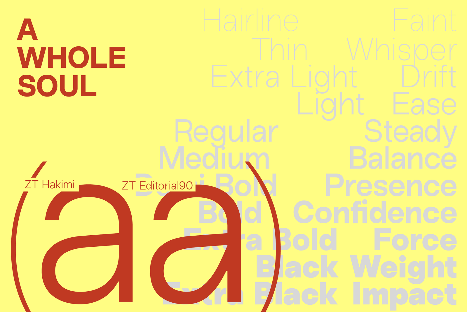
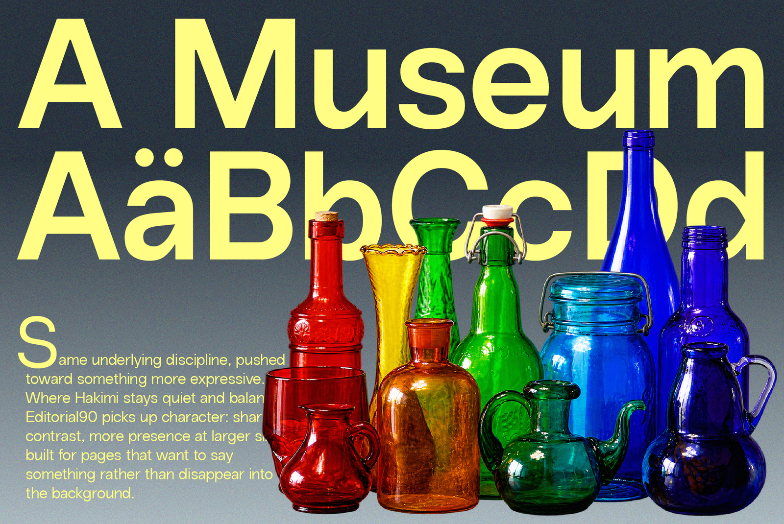
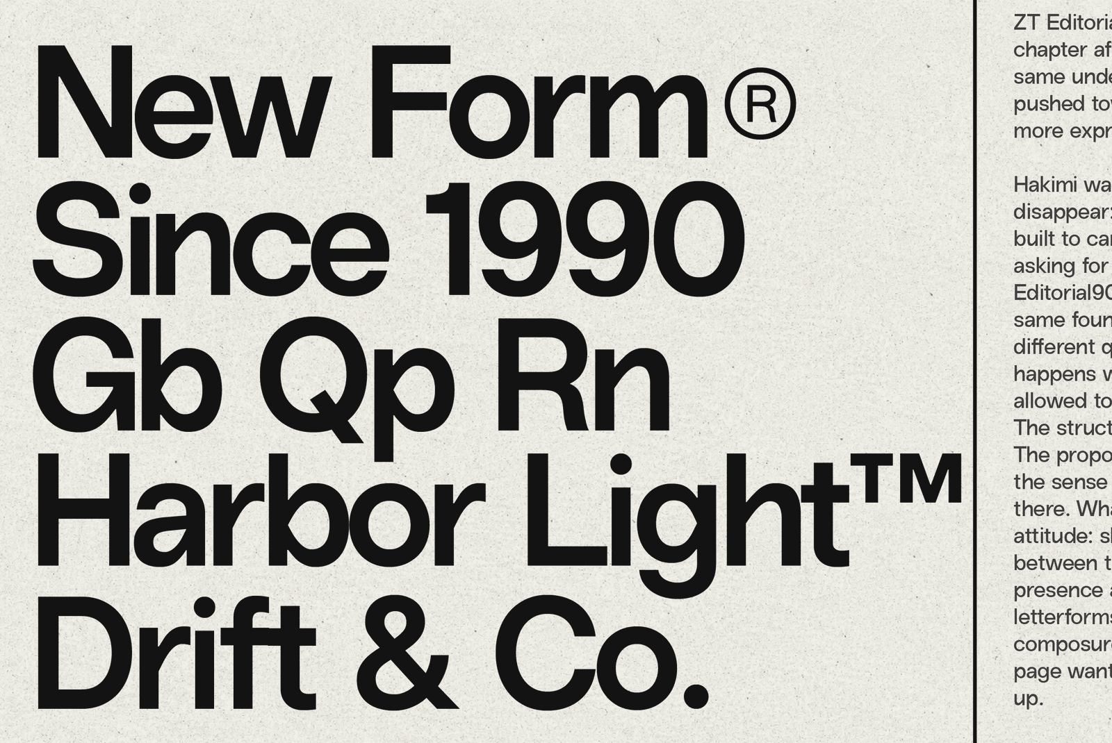
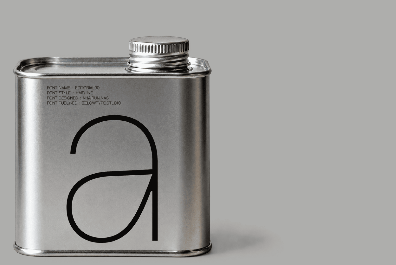
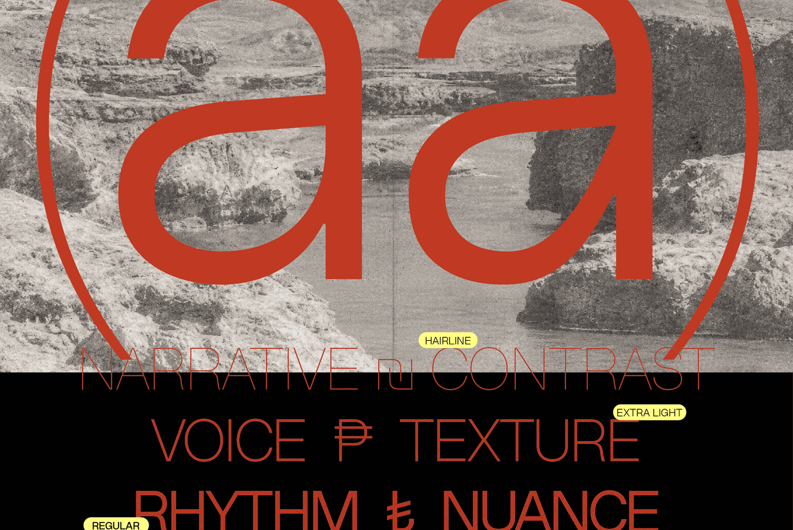
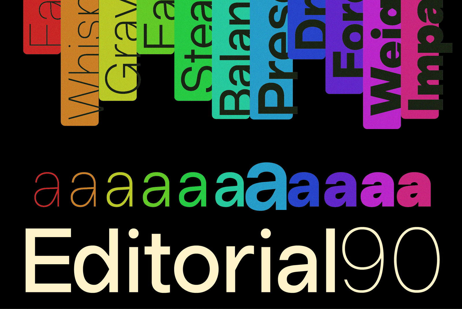
The bones are the same: the proportions, the rhythm, the sense of control that comes from thinking in systems rather than single letters. What’s different shows up at the letter level. The ‘a’ makes the point clearest: a flat, flag-like ear cuts sharply down into a long diagonal stroke before opening into a full, rounded bowl — an assertive gesture that Hakimi’s quieter construction doesn’t have. The same sharpened logic carries across b, d, g, h, m, n, p, q, r, u, and G.
This isn’t Hakimi dressed up, and it isn’t a different typeface wearing Hakimi’s name. It’s the same discipline, redrawn letter by letter to carry more character — built for the moments when type is meant to be read and noticed at once: headlines, covers, editorial spreads, anywhere a page needs to speak with authority instead of just holding information.
— Zelowtype
- ZT Editorial90 Style List
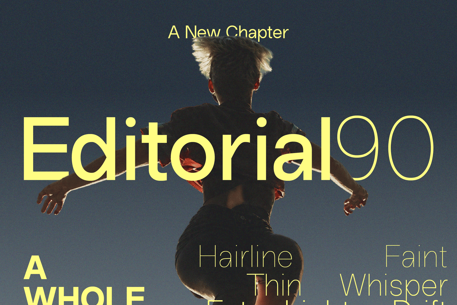
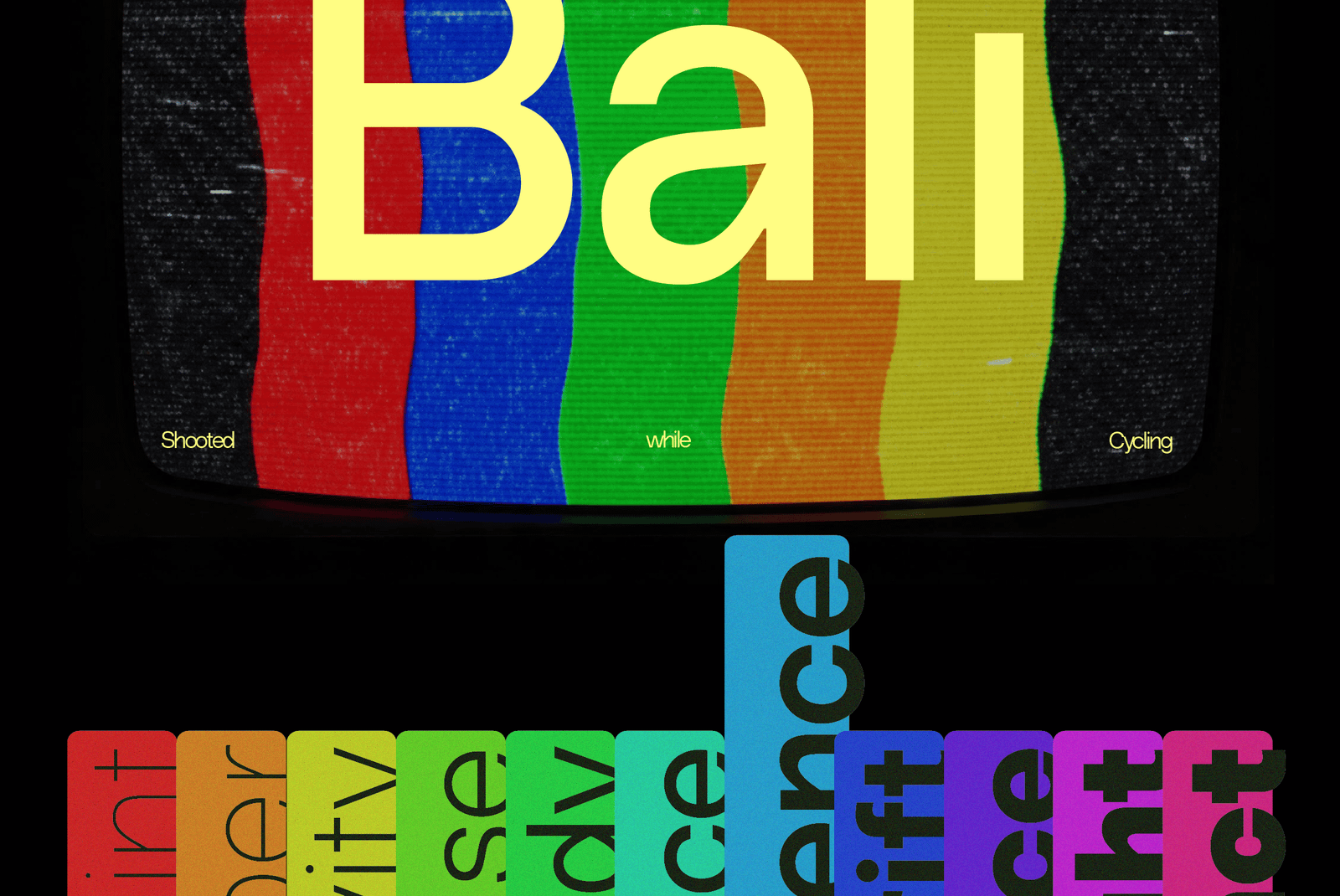
- 22 Styles
Hairline
Thin
Extra Light
Light
Regular
Medium
Demi Bold
Bold
Extra Bold
Black
Extra Black
Hairline Italic
Thin Italic
Extra Light Italic
Light Italic
Italic
Medium Italic
Demi Bold Italic
Bold Italic
Extra Bold Italic
Black Italic
Extra Black Italic
Style - ZT Editorial90 Black • 900
Size - 225px
Zelowtype ©2026
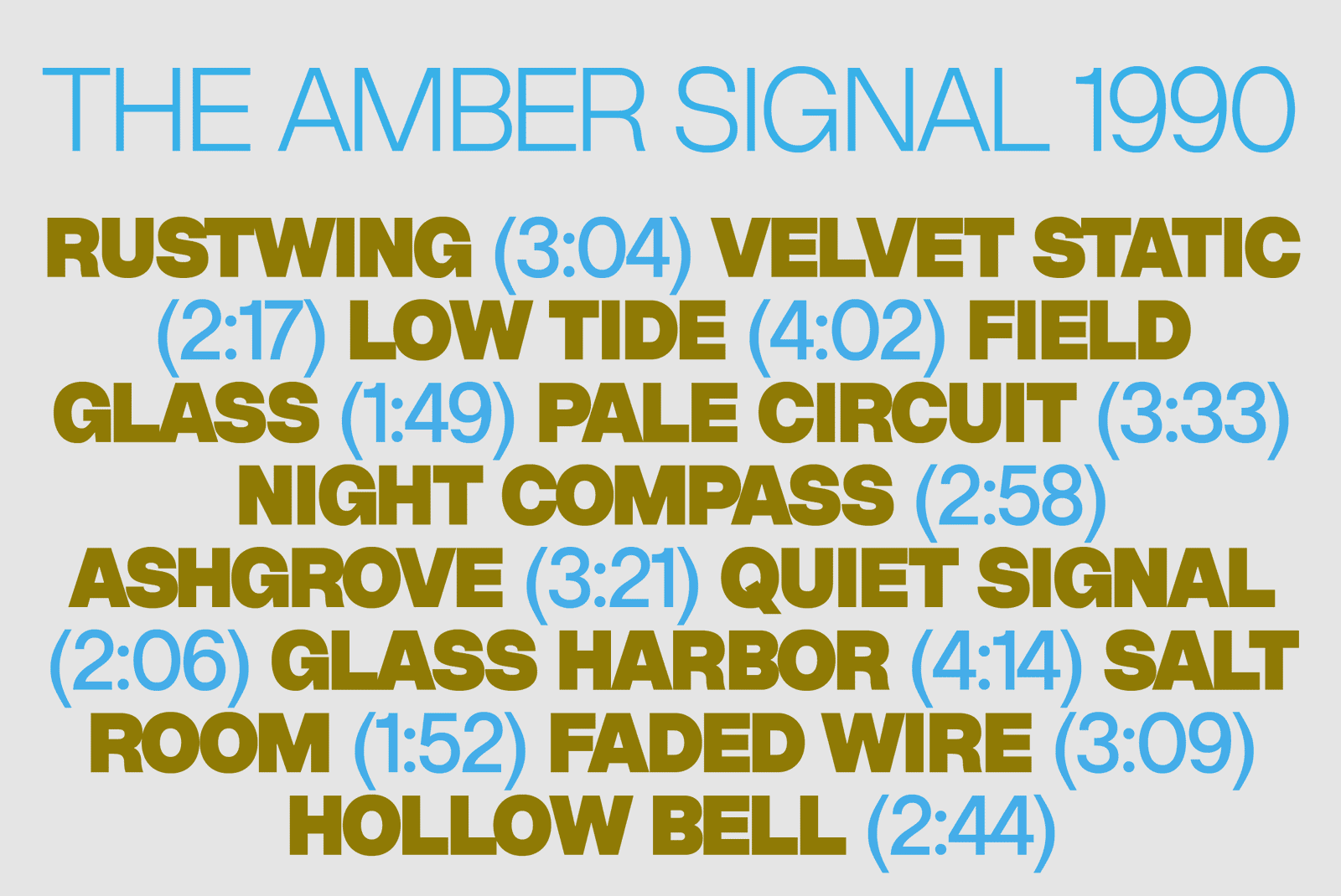
Structured. Deliberate. Unshaken.
Style - ZT Editorial90 Demi Bold • 600
Size - 225px
Zelowtype ©2026
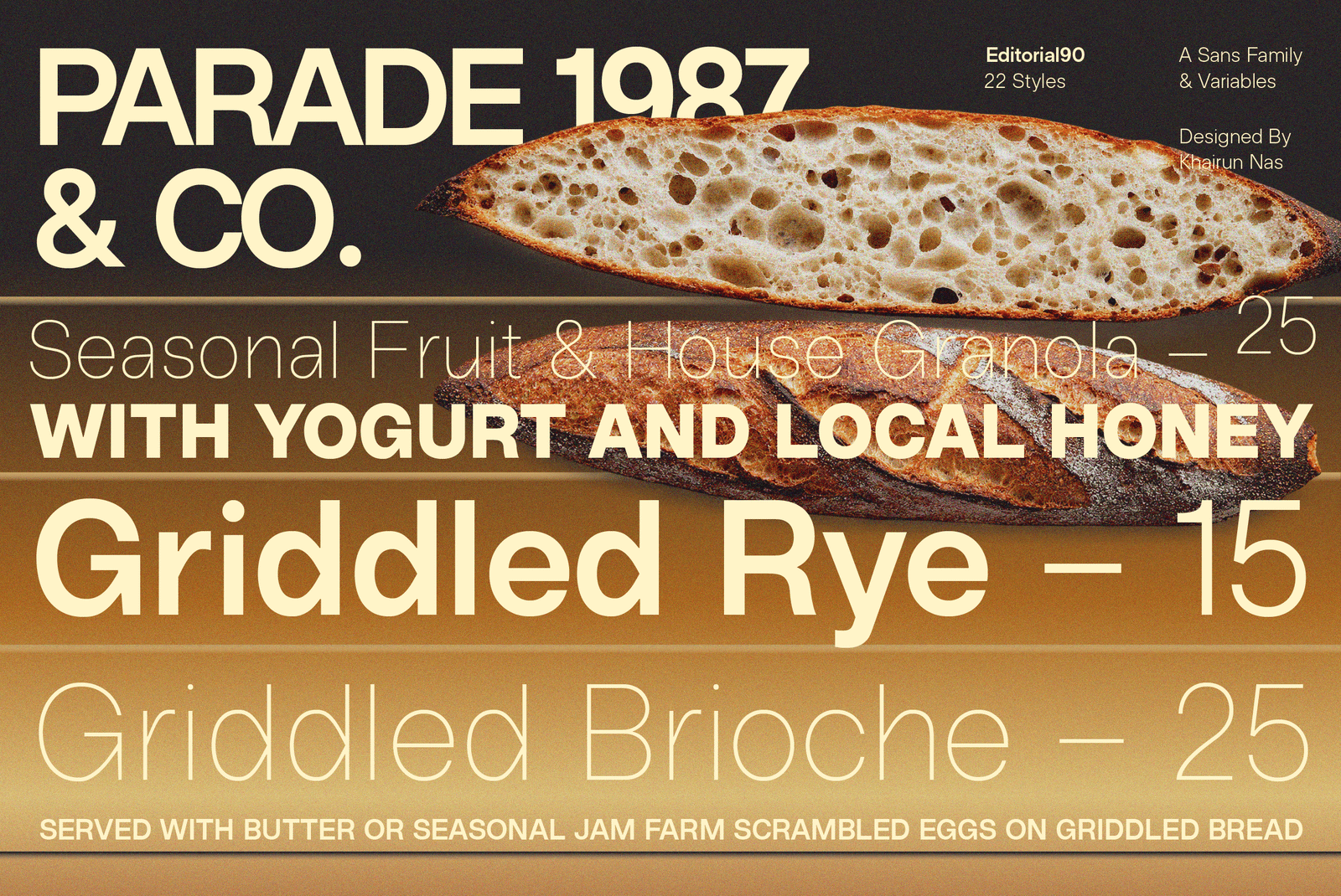
Every Letter Makes Its Case.
Style - ZT Editorial90 Thin • 100
Size - 225px
Zelowtype ©2026
Composed, Never Quiet.
Style - ZT Editorial90 Regular • 400
Size - 28px
Zelowtype ©2026
The bones are the same: the proportions, the rhythm, the sense of control that comes from thinking in systems rather than single letters. What’s different shows up at the letter level. The ‘a’ makes the point clearest: a flat, flag-like ear cuts sharply down into a long diagonal stroke before opening into a full, rounded bowl — an assertive gesture that Hakimi’s quieter construction doesn’t have. The same sharpened logic carries across b,d,g,h,m,n,p,q,r,u, and G.
Style - ZT Editorial90 Regular • 400
Size - 16px
Zelowtype ©2026
ZT Editorial90 takes the same disciplined foundation as ZT Hakimi and pushes it toward something bolder. Every redrawn stroke carries intent — sharper cuts, firmer angles, a flat flag-like ear that opens into a fuller, rounded bowl. Where Hakimi stays quiet and neutral, Editorial90 speaks with more weight in its gesture, carrying that same sharpened logic consistently across the full alphabet. The result is a typeface built to lead a layout, not just support it.
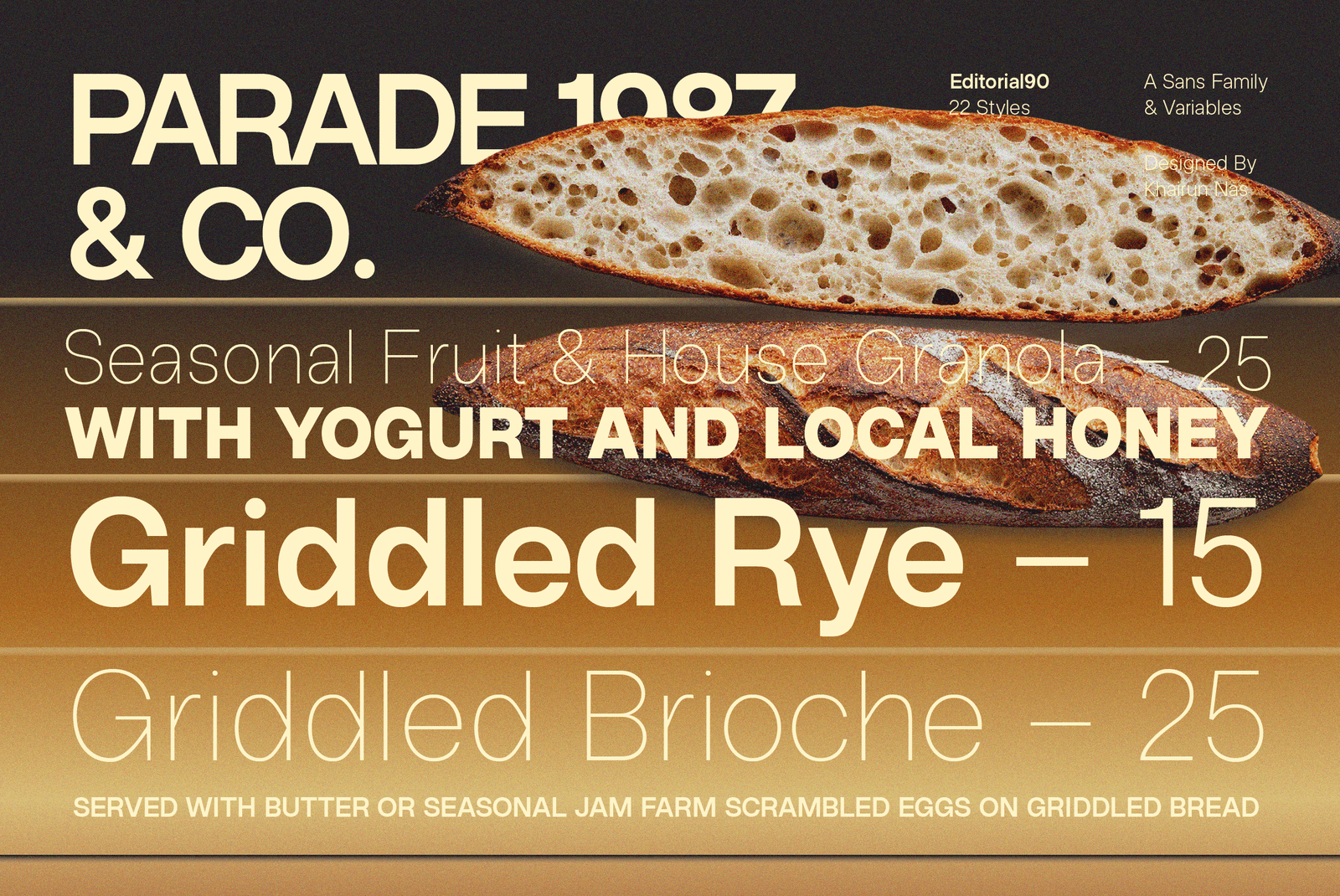
This makes ZT Editorial90 a natural fit wherever typography needs to carry weight and presence: editorial headlines, bold branding statements, posters, and cover design. It holds its character at large display sizes just as well as in smaller supporting text, without losing composure. Paired alongside ZT Hakimi, the two families offer a flexible range — one quiet and functional, the other expressive and assertive — ready for work that calls for personality.
Commercial Licenses
ZT Editorial90 Full Family (22 Styles + Variable)
Print License
E-Pub License
[ZelowStudio]
All Font
Support
- Licences
- Contact
- Terms
- Log In