
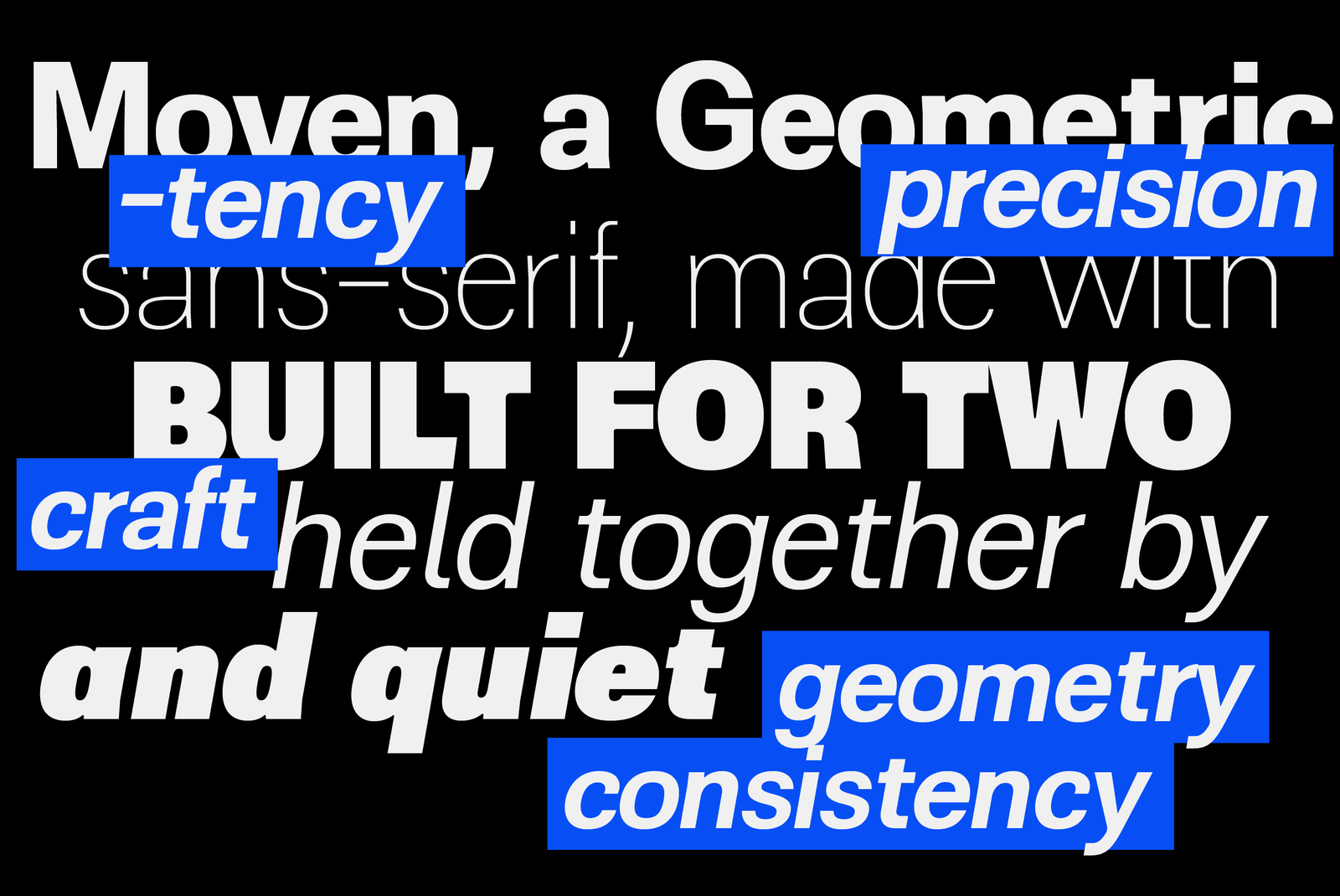
ZT Moven
- Free - 2 Styles (Personal & Commercial)
- Price - $39 (Complete Family)
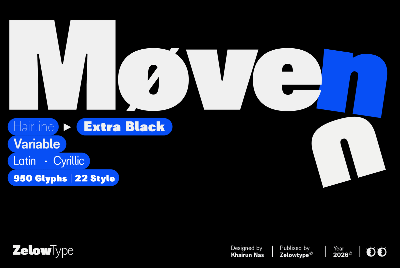
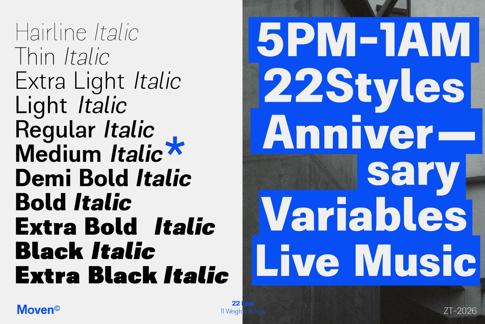
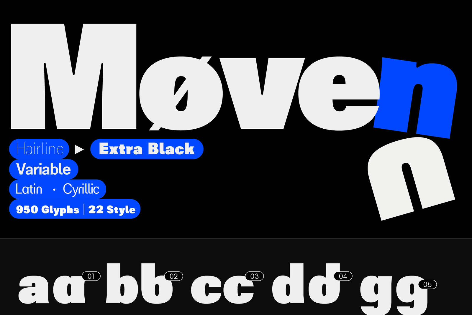
- 22 Styles (11 Regular + 11 Italic)
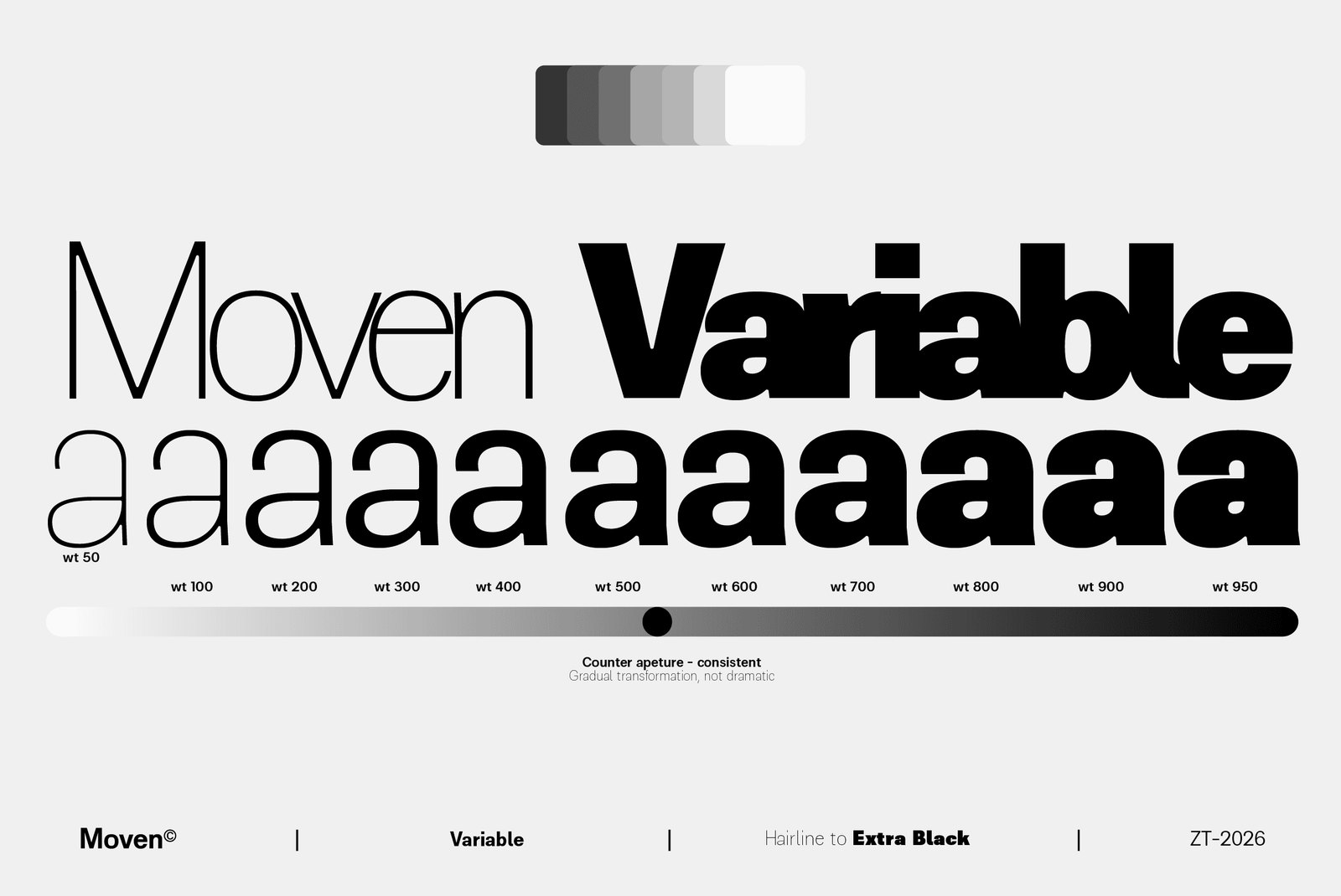
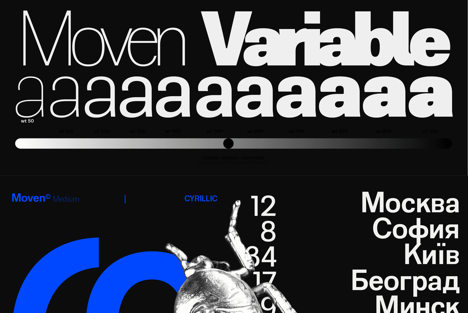
- Variable Axis - wt 50→950 (Roman + Italic)
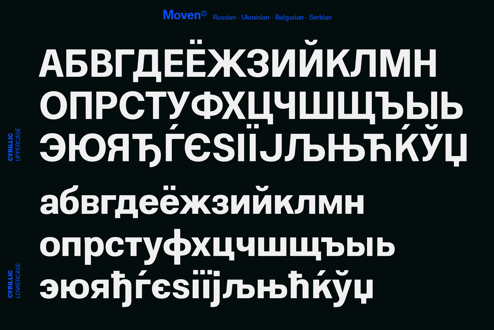
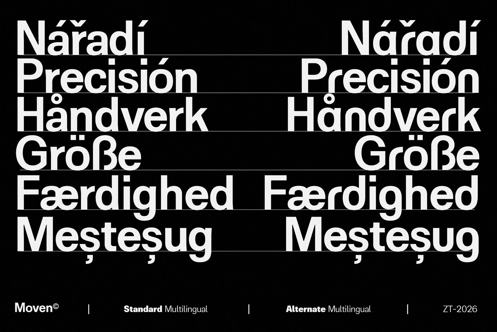
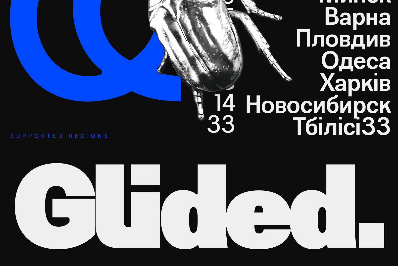
- Latin Extended + Cyrillic — Bulgarian & Serbian Localised Forms
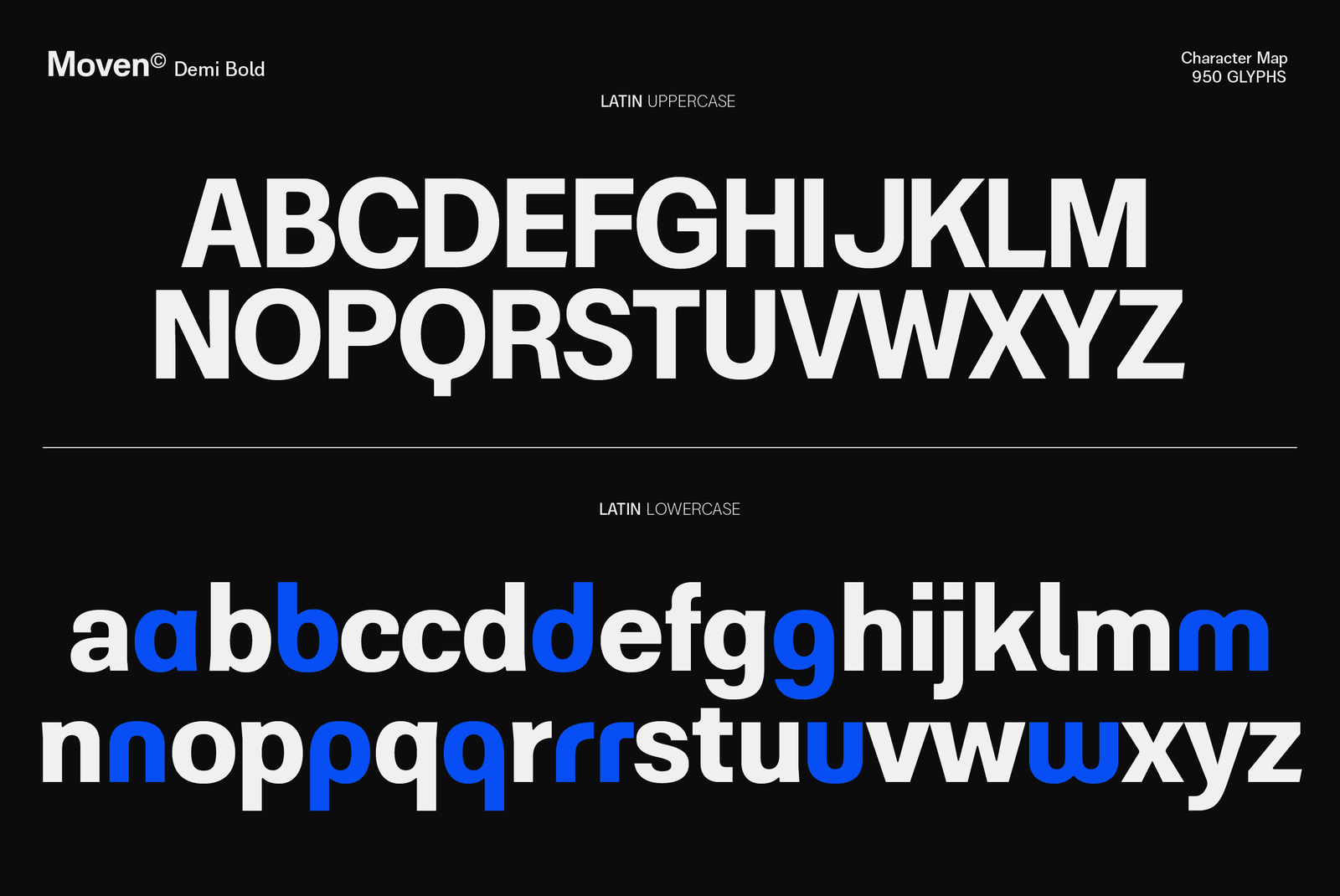
- 950 Glyphs
- File Formats - OTF, TTF, WOFF, WOFF2
- Version 1.000
- Specimens
- About
Aa
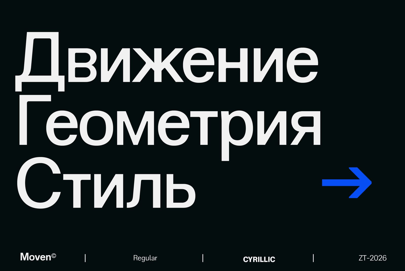
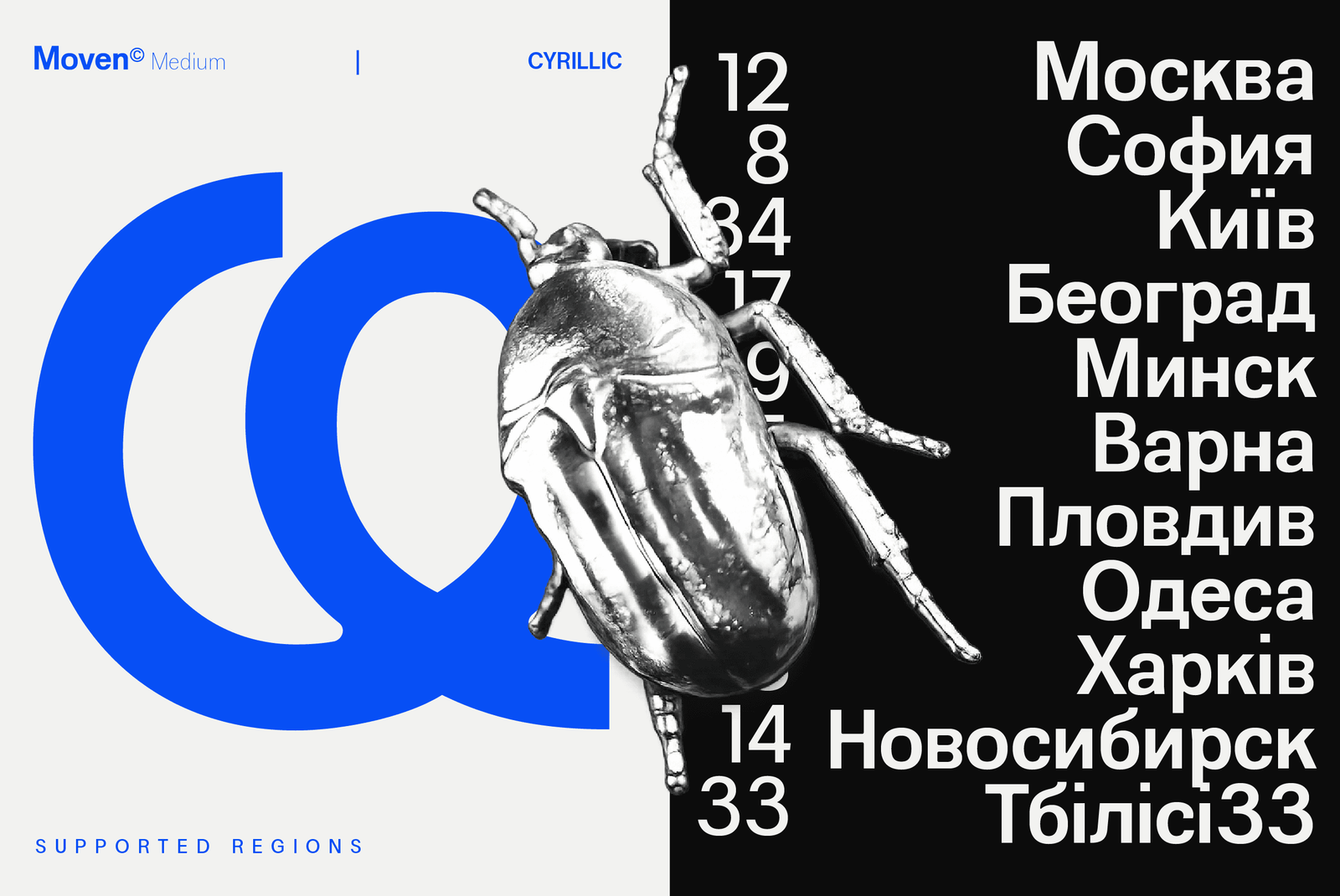
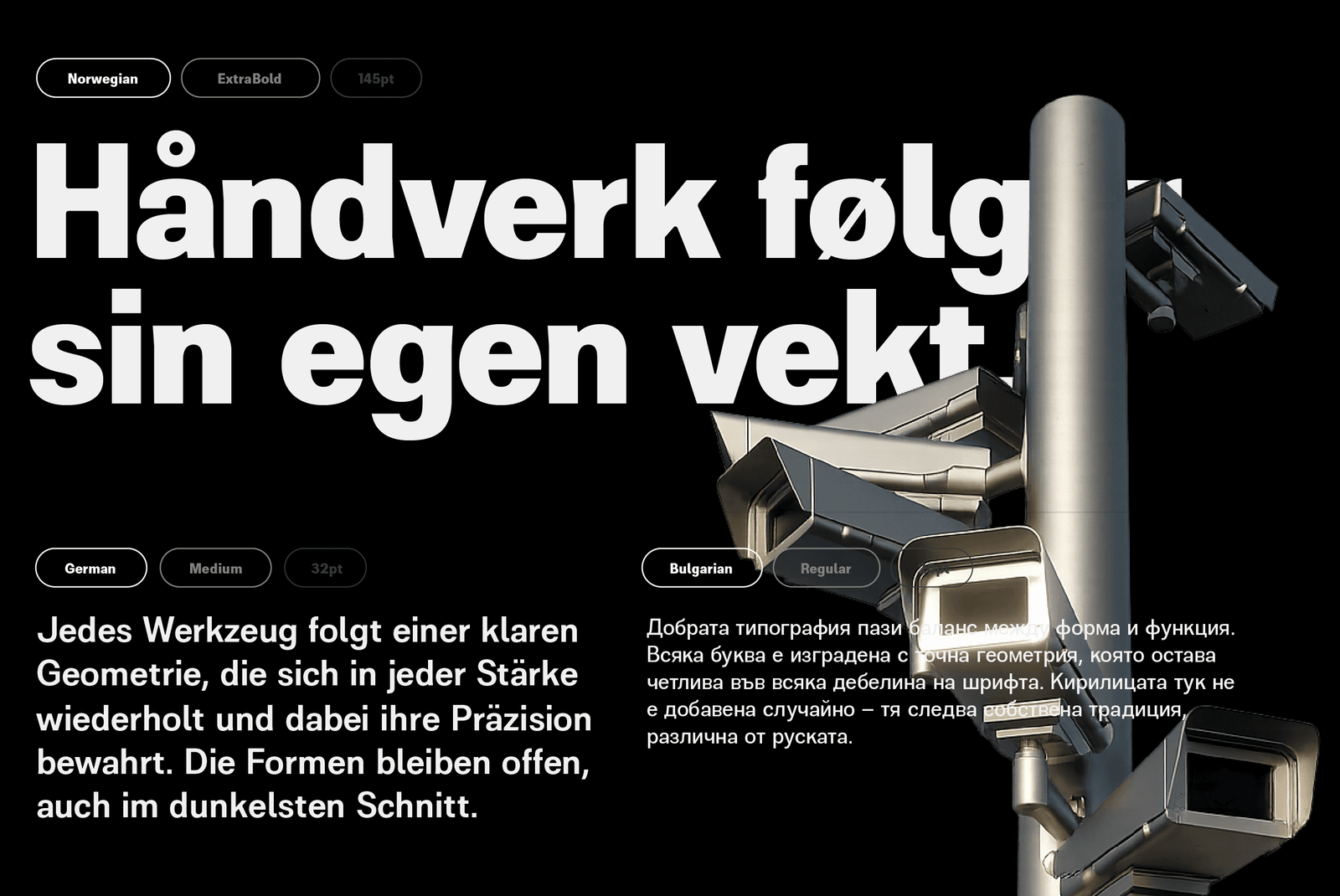
Most sans serifs marketed as Cyrillic-ready simply overlay Russian letterforms onto a Latin skeleton. ZT Moven treats Bulgarian and Serbian as separate design problems, drawing each according to its own regional conventions — so text set in either language reads as native, not substituted. This is the detail most $29 fonts skip entirely, and the reason ZT Moven exists.
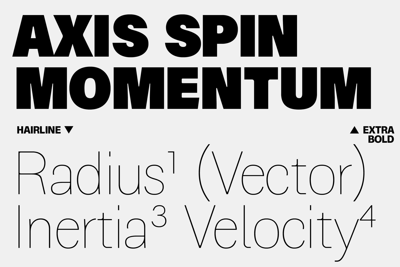
The same discipline carries through its weight range. Rather than redrawing each letter as it gains weight, ZT Moven holds one skeleton from Hairline to ExtraBlack. Counters stay proportionate at every step — open enough at the lightest end to avoid pinching shut, controlled enough at the heaviest to avoid clogging into black. Corners follow a selective treatment: sharp where strokes terminate, rounded through the counters, giving the geometry a precise, technical character rather than the soft uniformity of a generic rounded sans.
This restraint is what makes ZT Moven functional across contexts that most display-first geometric sans struggle with — dense body copy at text sizes, tight brand systems that need to hold up across a dozen touchpoints, and multilingual products where switching typefaces between scripts breaks visual continuity. It is built to disappear into good design rather than announce itself.
ZT Moven is designed by Khairunnas at Zelowtype, an independent type foundry based in Tapaktuan, Aceh, Indonesia — five years into building fonts that treat every script they claim to support with the same level of care.
- ZT Moven Style List
- 22 Styles
Hairline
Thin
Extra Light
Light
Regular
Medium
Demi Bold
Bold
Extra Bold
Black
Extra Black
Hairline Italic
Thin Italic
Extra Light Italic
Light Italic
Italic
Medium Italic
Demi Bold Italic
Bold Italic
Extra Bold Italic
Black Italic
Extra Black Italic
Style - ZT Moven Extra Black • 950
Size - 225px
Zelowtype ©2026
Built On Precision
Style - ZT Moven Bold • 700
Size - 225px
Zelowtype ©2026
Чистая Геометрия
Style - ZT Moven Regular • 400
Size - 200px
Zelowtype ©2026
The Shape of Precision
Style - ZT Moven Bold 700
Size - 24px
Zelowtype ©2026
ZT Moven is a geometric sans-serif built on precision — every curve, counter, and terminal calculated to hold its structure from the lightest Hairline to the heaviest ExtraBlack. Where many geometric sans typefaces soften or drift at the extremes, Moven stays consistent across the full range, weight after weight, size after size. Its twenty-two styles move as one continuous system: eleven weights in Roman, matched stroke for stroke by eleven in Italic, built on a single variable axis from wt 50 to 950. Beyond Latin Extended, Moven extends into Cyrillic with dedicated localised forms for Bulgarian and Serbian — precision that carries across alphabets, not just across weights.
Style - ZT Moven Light • 300
Size - 18px
Zelowtype ©2026
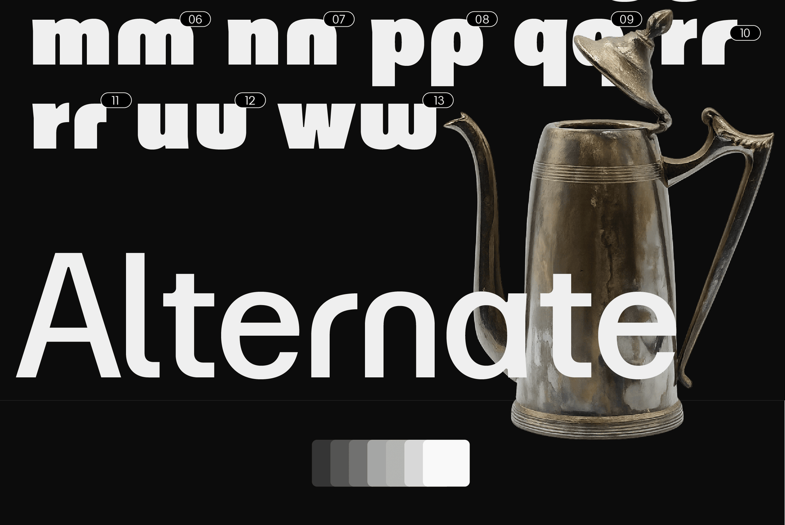
Every one of Moven's 950 glyphs was drawn to hold the same geometric logic, whether it sits at Hairline for a delicate editorial headline or ExtraBlack for a poster that needs to be read from across the room. The variable axis moves smoothly between them, so a single file can carry an entire identity system — from the lightest caption to the boldest cover line — without ever breaking its underlying structure. Moven is built for designers who need that range in one place: branding systems, editorial layouts, and interfaces that shift weight depending on context, but should never look like they belong to two different typefaces.
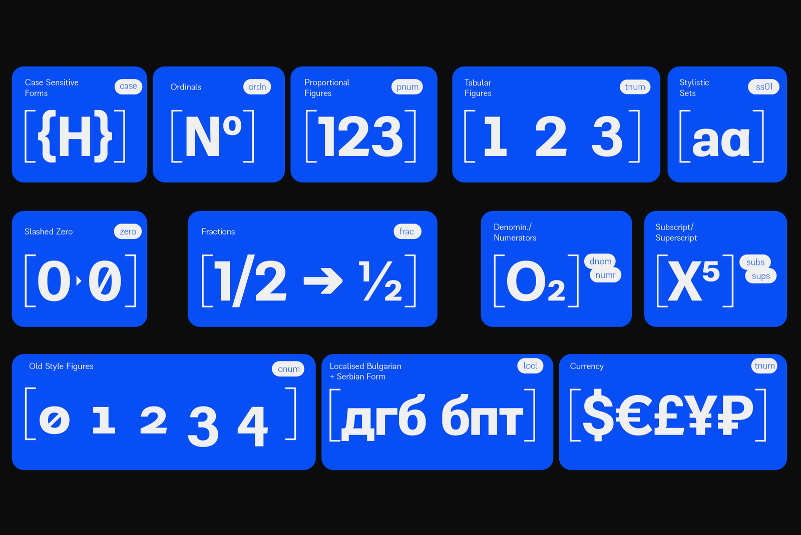
Moven was also built to work beyond a single alphabet. Its Cyrillic set isn't a mechanical transliteration of the Latin forms — it includes dedicated localised forms for Bulgarian and Serbian, so text reads naturally to native readers rather than looking borrowed. That makes Moven a practical choice for brands and publications working across Latin and Cyrillic markets at once, without needing a second typeface to carry the Cyrillic half of the system. Combined with a full set of OpenType features, Moven is built to hold up in real, multilingual, production use — not just in a specimen.
Commercial Licenses
ZT Moven Full Family (22 Styles + Variable)
APP License
Electronic Doc License
[ZelowStudio]
All Font
Support
- Licences
- Contact
- Terms
- Log In